

Tagged: photo image
-
AuthorPosts
-
frankgabriels_1961 Friend
frankgabriels_1961
- Join date:
- March 2017
- Posts:
- 48
- Downloads:
- 11
- Uploads:
- 42
- Thanks:
- 2
- Thanked:
- 1 times in 1 posts
March 7, 2018 at 12:39 pm #1095804Hi there,
Do we need to do something special with the sizes or formats of images that go with articles?
We uploaded an image to accompany our article but the image gets displayed in a different way on every device…
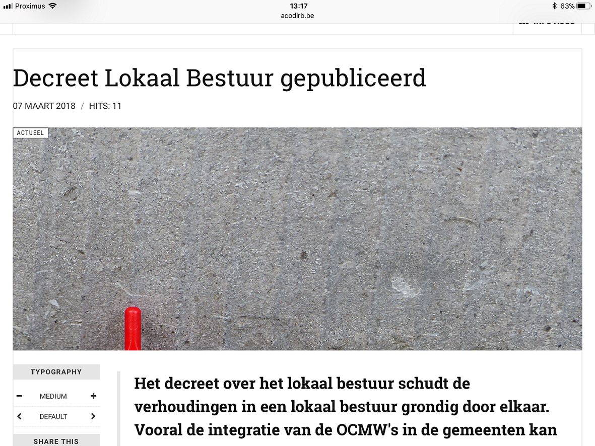
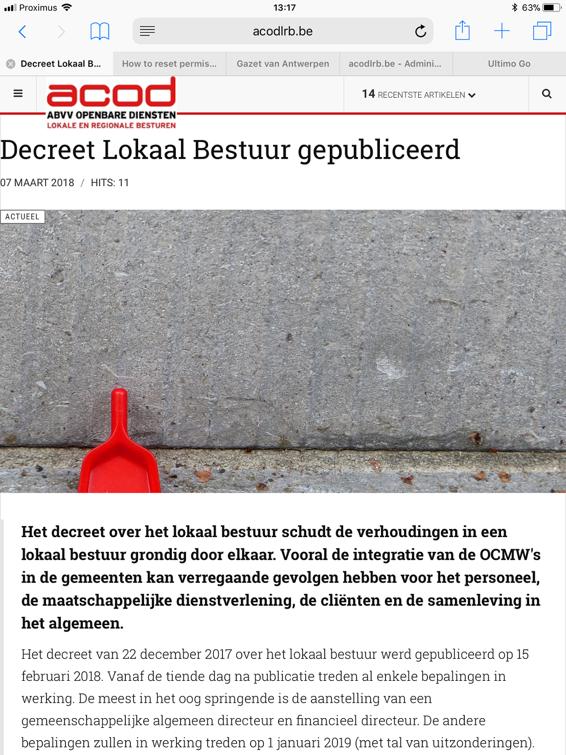
Attached are 4 examples:
- on iPhone in portrait mode (that is the complete & perfect view)
- on large size pc screen
- on iPad in portrait mode
- on iPad in landscape mode
What needs to be done to get perfect views on every device?
Thanks for your advice!
G’s
Werner

 Pankaj Sharma
Moderator
Pankaj Sharma
Moderator
Pankaj Sharma
- Join date:
- February 2015
- Posts:
- 24589
- Downloads:
- 144
- Uploads:
- 202
- Thanks:
- 127
- Thanked:
- 4196 times in 4019 posts
March 8, 2018 at 6:35 am #1095920Hi
There is a max-height defined for the article images in the template.
To show the full image in articles.
Open template folder/css/custom.css file and add below code.article-main .article-intro-media .item-image { max-height: 100%!important; }save file , clear Joomla cache and check.
Regards
AuthorPostsViewing 2 posts - 1 through 2 (of 2 total)This topic contains 1 reply, has 2 voices, and was last updated by
Pankaj Sharma 6 years, 11 months ago.We moved to new unified forum. Please post all new support queries in our New Forum
Jump to forum