-
AuthorPosts
-
cougniot Friend
cougniot
- Join date:
- October 2008
- Posts:
- 31
- Downloads:
- 0
- Uploads:
- 4
- Thanks:
- 3
- Thanked:
- 1 times in 1 posts
May 13, 2014 at 4:56 pm #197724Hi,
I’d to know how to disable the max size responsive where the slideshow takes all the screen size.
I prefer the previous size (about 1200px), where slideshow is aligned with bottom content.I search for in CSS files, but I don’t founded where to make this change to disable 1400px size.
Do you have an idea ?Preview correct resizing for me I’d like to keep when navigator becomes bigger :
Preview of the higher resizing (1400px…) I’d like to disable


 TomC
Moderator
TomC
Moderator
TomC
- Join date:
- October 2014
- Posts:
- 14077
- Downloads:
- 58
- Uploads:
- 137
- Thanks:
- 948
- Thanked:
- 3155 times in 2495 posts
May 13, 2014 at 5:15 pm #534925Access to view your site appears to be password protected.
Will need the access login information to inspect the issue further.
cougniot
- Join date:
- October 2008
- Posts:
- 31
- Downloads:
- 0
- Uploads:
- 4
- Thanks:
- 3
- Thanked:
- 1 times in 1 posts
May 13, 2014 at 5:45 pm #534936It is open now
TomC
Moderator
TomC
- Join date:
- October 2014
- Posts:
- 14077
- Downloads:
- 58
- Uploads:
- 137
- Thanks:
- 948
- Thanked:
- 3155 times in 2495 posts
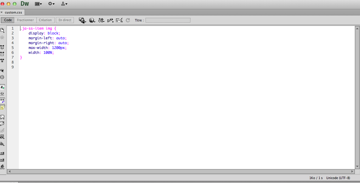
May 13, 2014 at 5:51 pm #534940Try This . . . .
If you haven’t yet done so,, create a new file called “custom.css” within file path –> /templates/ja_decor/css
Within that custom.css file, paste the following CSS rule:
.ja-ss-item img {

    display: block;

    margin-left: auto;

    margin-right: auto;

    max-width: 1200px;

    width: 100%;

}
SAVE CHANGES – CLEAR CACHE – REFRESH PAGE
How does that look?
cougniot
- Join date:
- October 2008
- Posts:
- 31
- Downloads:
- 0
- Uploads:
- 4
- Thanks:
- 3
- Thanked:
- 1 times in 1 posts
May 13, 2014 at 6:03 pm #534947Hi, thanks for your answer.
I tested it, it is online, but you’ll see when I increase the navigator size, I always have the same problemTomC
Moderator
TomC
- Join date:
- October 2014
- Posts:
- 14077
- Downloads:
- 58
- Uploads:
- 137
- Thanks:
- 948
- Thanked:
- 3155 times in 2495 posts
May 13, 2014 at 6:18 pm #534954<em>@cougniot 427006 wrote:</em><blockquote>Hi, thanks for your answer.
I tested it, it is online, but you’ll see when I increase the navigator size, I always have the same problem</blockquote>I don’t see the changes implemented as I suggested . . . did you enter the above CSS modifications?
cougniot
- Join date:
- October 2008
- Posts:
- 31
- Downloads:
- 0
- Uploads:
- 4
- Thanks:
- 3
- Thanked:
- 1 times in 1 posts
May 13, 2014 at 8:00 pm #534969yes sure, the custom.css file is online at the right place
template/ja_decor/custom.cssTomC
Moderator
TomC
- Join date:
- October 2014
- Posts:
- 14077
- Downloads:
- 58
- Uploads:
- 137
- Thanks:
- 948
- Thanked:
- 3155 times in 2495 posts
May 13, 2014 at 8:16 pm #534974<em>@cougniot 427032 wrote:</em><blockquote>yes sure, the custom.css file is online at the right place
template/ja_decor/custom.css</blockquote>Nope . . . . it needs to be—> templates/ja_decor/css/custom.css
cougniot
- Join date:
- October 2008
- Posts:
- 31
- Downloads:
- 0
- Uploads:
- 4
- Thanks:
- 3
- Thanked:
- 1 times in 1 posts
May 14, 2014 at 7:30 am #535048This well where it is…
and the content file :

 TomC
Moderator
TomC
Moderator
TomC
- Join date:
- October 2014
- Posts:
- 14077
- Downloads:
- 58
- Uploads:
- 137
- Thanks:
- 948
- Thanked:
- 3155 times in 2495 posts
May 14, 2014 at 3:09 pm #535123Please temporarily set “Optimize CSS” to “Off” within your Template Manager–General settings.
Let me know when you’ve done this.
 Ninja Lead
Moderator
Ninja Lead
Moderator
Ninja Lead
- Join date:
- November 2014
- Posts:
- 16064
- Downloads:
- 310
- Uploads:
- 2864
- Thanks:
- 341
- Thanked:
- 3854 times in 3563 posts
May 15, 2014 at 9:30 am #535287<em>@cougniot 426964 wrote:</em><blockquote>Hi,
I’d to know how to disable the max size responsive where the slideshow takes all the screen size.
I prefer the previous size (about 1200px), where slideshow is aligned with bottom content.I search for in CSS files, but I don’t founded where to make this change to disable 1400px size.
Do you have an idea ?Preview correct resizing for me I’d like to keep when navigator becomes bigger :
Preview of the higher resizing (1400px…) I’d like to disable
</blockquote>You can follow step below to change width size from 1400px to 1200px.
Open the templates/ja_decor/less/variables.less file,
Change
257  // Large screen / wide desktop

258  // Note: Deprecated @screen-lg and @screen-lg-desktop as of v3.0.1

259: @screen-lg:                  1400px;

260  @screen-lg-min:              @screen-lg;

261  @screen-lg-desktop:          @screen-lg-min;

...

662

663  // Large screen / wide desktop

664: @container-large-desktop:      ((1400px + @grid-gutter-width));

665  @container-lg:                 @container-large-desktop;

666  @container-lg-max:             @container-lg - 1;
To
257  // Large screen / wide desktop

258  // Note: Deprecated @screen-lg and @screen-lg-desktop as of v3.0.1

259: @screen-lg:                  1200px;

260  @screen-lg-min:              @screen-lg;

261  @screen-lg-desktop:          @screen-lg-min;

...

662

663  // Large screen / wide desktop

664: @container-large-desktop:      ((1200px + @grid-gutter-width));

665  @container-lg:                 @container-large-desktop;

666  @container-lg-max:             @container-lg - 1;
Once done, click compile LESS to CSS button from ja_decor – Default of template manager.
-
AuthorPosts
Viewing 11 posts - 1 through 11 (of 11 total)This topic contains 11 replies, has 3 voices, and was last updated by
Ninja Lead 10 years, 8 months ago.We moved to new unified forum. Please post all new support queries in our New Forum
Jump to forum
melih

