-
AuthorPosts
-
August 28, 2016 at 10:49 pm #963518
Hi,
I have 2 questions.
Question 1, using the corporate layout, I have 3 articles published on the main page. (http://www.cuoscdemo.co.uk/index.php)
I’m still not entirely sure how that’s working, but I’ve figured that so long as I categorise an article as ‘Corporate’, it appears there, which is fine.
My question relates to the ‘Publish Date’…it doesn’t appear on the main screen; however when you select the ‘Read More’ button and view the full article, then the Publish Date appears.
How do I get the Publish Date to appear on the main screen too?
Also, question number 2:
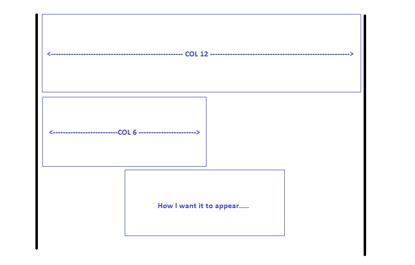
In my ‘Position 1’, I have an image ‘Become a Member’. It is responsive which means it appears great on small devices; however on big devices, the image takes up the full width, and is too big. I’d like to make the image smaller. I tried editing the template and responsive layout for ‘Large’ devices. The position was set to ’12’; however I’ve changed that to ‘6’ to get it to a size that I’m happy with; however how do I center align the position so there’s not a huge white gap on the right?
 Pankaj Sharma
Moderator
Pankaj Sharma
Moderator
Pankaj Sharma
- Join date:
- February 2015
- Posts:
- 24589
- Downloads:
- 144
- Uploads:
- 202
- Thanks:
- 127
- Thanked:
- 4196 times in 4019 posts
August 29, 2016 at 2:40 am #963596Hi
For the article views on the Corporate layout , take a look on thisdocumentation how its configured .
For the date issue , kindly check the menu options show publish date is set to SHOW , read more option is added so that on the layout view you have intro text to show for the articles .
For the last question, you have to use col 12 so that I will use full space and comes in the centre . Col 6 is the half and does not put the image on the right side because space is not used by the col-6 .August 29, 2016 at 1:37 pm #963794Hi, thank you for your reply; however with regards the date issue, I already have ‘Publish Date’ set to SHOW, and this is indeed when you click the Read More button, because it does show the date. However on the main screen, it does not. You can see for yourself -> http://www.cuoscdemo.co.uk
Also, the next question. I don’t want to use col 12 because I don’t want the image/module to be blown up. I want it to be the current size that is, but centrally aligned (see attachment); however on smaller devices I do want it to shrink,so be responsive in that sense.
Pankaj Sharma
Moderator
Pankaj Sharma
- Join date:
- February 2015
- Posts:
- 24589
- Downloads:
- 144
- Uploads:
- 202
- Thanks:
- 127
- Thanked:
- 4196 times in 4019 posts
August 30, 2016 at 1:32 am #964050Hi
you can apply a max-width style on the image and then apply it on the col-12 . because the image container does not have a full width it can comes in the center of the site .
For the date issue , kindly sends me temp super user details of the site , I will check this .August 30, 2016 at 2:27 pm #964266This reply has been marked as private.August 30, 2016 at 2:54 pm #964270max-width style on the image and then apply it on the col-12 . because the image container does not have a full width it can comes in the center of the site
Can you clarify what you mean? This is the code I have – should that img style be different/somewhere else? I’ve set the position back to col-12 now too.
<img class="img-responsive" style="max-width: 50%;" src="/images/BecomeAMember.png" alt="Become a Member">Pankaj Sharma
Moderator
Pankaj Sharma
- Join date:
- February 2015
- Posts:
- 24589
- Downloads:
- 144
- Uploads:
- 202
- Thanks:
- 127
- Thanked:
- 4196 times in 4019 posts
August 31, 2016 at 2:43 am #964453Hi
use this code<p style=" text-align: center; "><a href="/index.php/join"><img class="" style="max-width: 50%;" src="/images/BecomeAMember.png" alt="Become a Member"></a></p>becuase you are using img-responsive , it will not use your custom style , it use the style defined for this class .
http://prntscr.com/cccamu
For the dates the Publish date are hidden for home menu i set them to show and now u can see the dates on front end .August 31, 2016 at 7:31 am #964487Pankaj you’re a star! Thanks. Such a simple solution too – I often over complicate things and looked beyond the obvious!
Thanks again.
August 31, 2016 at 7:25 pm #964673Ah, one final thing Pankaj, I’ve used this code:
<p style="text-align: center;"><a href="/index.php/join"><img class="" style="max-width: 50%;" src="/images/BecomeAMember.png" alt="Become a Member"></a></p>It works great on PC’s; however on smaller displays (mobiles/tablets etc) I want it to be 100% width, and fully responsive. Is this possible?
Pankaj Sharma
Moderator
Pankaj Sharma
- Join date:
- February 2015
- Posts:
- 24589
- Downloads:
- 144
- Uploads:
- 202
- Thanks:
- 127
- Thanked:
- 4196 times in 4019 posts
September 1, 2016 at 1:56 am #964752Hi
Apply the max-width value in px for example : 800px . save and check .AuthorPostsViewing 10 posts - 1 through 10 (of 10 total)This topic contains 9 replies, has 2 voices, and was last updated by
Pankaj Sharma 7 years, 7 months ago.We moved to new unified forum. Please post all new support queries in our New Forum
Corporate Layout – Articles Published Date & Module Alignment
Viewing 10 posts - 1 through 10 (of 10 total)