-
AuthorPosts
-
 sparkktv
Friend
sparkktv
Friend
sparkktv
- Join date:
- April 2009
- Posts:
- 24
- Downloads:
- 92
- Uploads:
- 4
- Thanks:
- 1
- Thanked:
- 5 times in 3 posts
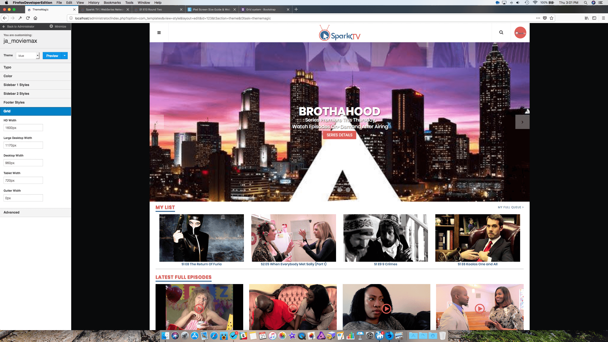
December 21, 2017 at 8:22 pm #1082751I’m working in localhost not my Live site, but I’m messing around with the grid sizes and wanted to change them to the following from.
HD Width: 1600px > 1920px
Large Desktop Width: 1140px > 1400px
Desktop Width: 940px > 1024px
Tablet Width: 720px > 768pxThe reason I wanted to make the change is that the black bars on the side don’t appear on the site except if your using a huge monitor over 1920px. But everytime I make the change the site becomes messed up. The responsive part when you shrink the site has items cut off on the right side of the screen until it reaches one of the next sizes down. Is there more I need to edit or is this just not something that is possible with this template.I attached a screenshot so you can see what I’m talking about. I know there are sizes in template.css, do those need to be edited and to what if so?
Saguaros Moderator
Saguaros
- Join date:
- September 2014
- Posts:
- 31405
- Downloads:
- 237
- Uploads:
- 471
- Thanks:
- 845
- Thanked:
- 5346 times in 4964 posts
December 22, 2017 at 7:33 am #1082849Hi,
I’m not quite sure which page are you referring to, if possible, put your site online and share the credentials of your site, I will check for you.
Regards
sparkktv
Friend
sparkktv
- Join date:
- April 2009
- Posts:
- 24
- Downloads:
- 92
- Uploads:
- 4
- Thanks:
- 1
- Thanked:
- 5 times in 3 posts
December 22, 2017 at 4:06 pm #1082918It’s in ThemeMagic under Grid inside the template. My site is online but I do all my testing in localhost. I attached an image of the part I’m talking about in ThemeMagic.
-
This reply was modified 7 years, 1 month ago by sparkktv. Reason: Image didn't add
Saguaros
- Join date:
- September 2014
- Posts:
- 31405
- Downloads:
- 237
- Uploads:
- 471
- Thanks:
- 845
- Thanked:
- 5346 times in 4964 posts
December 25, 2017 at 7:50 am #1083140Hi,
That settings is equivalent to this declaration:
// Container sizes
// --------------------------------------------------

// Small screen / tablet
@container-tablet:             ((720px + @grid-gutter-width));
@container-sm:                 @container-tablet;

// Medium screen / desktop
@container-desktop:            ((940px + @grid-gutter-width));
@container-md:                 @container-desktop;

// Large screen / wide desktop
@container-large-desktop:      ((1140px + @grid-gutter-width));
@container-lg:                 @container-large-desktop;

// Very Large screen
@container-hd-desktop:         ((1600px + @grid-gutter-width));;
@container-hd:                 @container-hd-desktop;
in this LESS file: root/templates/ja_moviemax/less/variables.less
Did you try to change via this file?
AuthorPostsViewing 4 posts - 1 through 4 (of 4 total)This topic contains 3 replies, has 2 voices, and was last updated by
Saguaros 7 years, 1 month ago.
We moved to new unified forum. Please post all new support queries in our New Forum
Jump to forum
melih