-
AuthorPosts
-
September 2, 2014 at 6:58 pm #201010
Hello,
I would like to have a banner (responsive) which would be placed on the top of my page.
Inside template management, I select a logo and select “Enable Small Logo”.
Then, in custom.css, I had
.logo-image > a {
margin-top: 5px;
max-width: none;
max-height: none;
}
The result is as follow :
On my computer, I have a big logo, but it’s on the left (not centred), and off-canvas icon is on the top left corner of it, and the search item are on the top right corner of it.
On a smartphone screen, well, I have the small logo (yeah, it’s responsive), but it’s hided by the search items, and off-canvas icon is also on the left corner… and I don’t think it’s centred but there difficult to juged 🙂I attach two picture to show you how it is.
Do you have any idea to make that nice?
Thank you in advance for any help.

chavan Friend
chavan
- Join date:
- October 2014
- Posts:
- 4612
- Downloads:
- 0
- Uploads:
- 110
- Thanked:
- 1440 times in 1290 posts
September 3, 2014 at 1:48 am #548040please post your Site Url
September 3, 2014 at 3:27 am #548060Well the thing is that I work on local for this improvement.
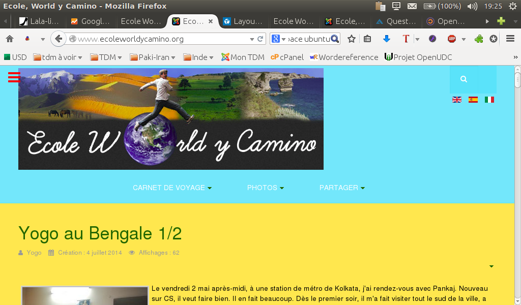
My live website http://www.ecoleworldycamino.org/ , has a custom html code to display a fixe banner. Maybe that help you to understand what I want, except that I don’t care if the banner is inside the blue shape (which would have to happen with the logo solution I guess) or if it is on top of it as it is now.
Thanks for answering so quickly.chavan
- Join date:
- October 2014
- Posts:
- 4612
- Downloads:
- 0
- Uploads:
- 110
- Thanked:
- 1440 times in 1290 posts
September 3, 2014 at 4:41 am #548078I know the issue. To provide a css fix, I need to view your site. so, Please upload your site to the development server and provide a link
September 3, 2014 at 5:44 am #548086ok, I did the modification on my live website.
Inside template management, I select a logo and select “Enable Small Logo”.
Then, in custom.css, I had
.logo-image > a {
margin-top: 5px;
max-width: none;
max-height: none;
}Here is my website :
http://www.ecoleworldycamino.org/Thanks,
chavan
- Join date:
- October 2014
- Posts:
- 4612
- Downloads:
- 0
- Uploads:
- 110
- Thanked:
- 1440 times in 1290 posts
September 3, 2014 at 1:22 pm #548150I don’t see any anything like the screenshot you have attached in the first post. please replicate the issue. so i could check on the site and provide a fix.
September 3, 2014 at 1:58 pm #548155Maybe because you watch the english version of my website, whereas I work first on the french version. Please click on the little flag blue white red.
I took two new screenshot to show you what I mean by :
I have a big logo, but it’s on the left (not centred), and off-canvas icon is on the top left corner of it, and the search item is on the top right corner of it. I would like that both of them go under the banner, at the same level than the menu.One with firefox and one with chromium.
What do you think?
 September 4, 2014 at 2:44 pm #548308
OK, thank you Chavan for trying to help me but I found an other way that palying with css and the logo.
I detail in the link below how to add a centred responsive banner on the top of your banner :http://www.joomlart.com/forums/topic/a-banner-above-everything/
Good luck for the next one.
-
AuthorPosts
Viewing 8 posts - 1 through 8 (of 8 total)This topic contains 8 replies, has 2 voices, and was last updated by
thatoo 9 years, 8 months ago.
We moved to new unified forum. Please post all new support queries in our New Forum
Jump to forum

