

-
AuthorPosts
-
linnea Friend
linnea
- Join date:
- April 2015
- Posts:
- 68
- Downloads:
- 0
- Uploads:
- 9
- Thanks:
- 24
- Thanked:
- 1 times in 1 posts
May 18, 2015 at 11:50 am #206430Hi there,
I have been building a slideshow for my website using the ACM block slideshow with style-3. I would like to add a button class so that my links show up a bit better but am not sure where to find this information. I would appreciate it if someone could point me in the direction of the proper instructions. Thanks!
polo974 Friend
polo974
- Join date:
- May 2015
- Posts:
- 63
- Downloads:
- 133
- Uploads:
- 4
- Thanks:
- 13
- Thanked:
- 5 times in 2 posts
May 18, 2015 at 1:25 pm #570929Hi,
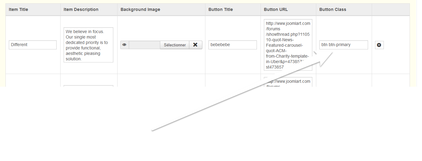
You can use the button class field located here :
In this field you can put every button class used in uber (like “btn btn-primary”, “btn btn-rounded btn-warning” etc…) or create your own style and put in a custom.css file…
1 user says Thank You to polo974 for this useful post
linnea
- Join date:
- April 2015
- Posts:
- 68
- Downloads:
- 0
- Uploads:
- 9
- Thanks:
- 24
- Thanked:
- 1 times in 1 posts
May 18, 2015 at 1:51 pm #570932Ok, thank you. I guess I was wondering if there was a list of all the button classes somewhere in the Uber documentation. I have been looking at the Uber Demo Typo page but it seems a bit clumsy to have to inspect the element in my browser to find out the class. But maybe that’s the only way to do it?
polo974
- Join date:
- May 2015
- Posts:
- 63
- Downloads:
- 133
- Uploads:
- 4
- Thanks:
- 13
- Thanked:
- 5 times in 2 posts
May 18, 2015 at 1:58 pm #570933In variable.less file in your template folder you have this :
// Buttons

// -------------------------
@btn-font-weight: @font-weight-normal;
@btn-default-color: #fff
@btn-default-bg: @gray-dark;
@btn-default-border: darken @gray-dark, 5%);@btn-primary-color: #fff
@btn-primary-bg: @brand-primary;
@btn-primary-border: @brand-primary;@btn-success-color: #fff
@btn-success-bg: @brand-success;
@btn-success-border: darken(@btn-success-bg, 5%);@btn-warning-color: #fff
@btn-warning-bg: @brand-warning;
@btn-warning-border: darken(@btn-warning-bg, 5%);@btn-danger-color: #fff
@btn-danger-bg: @brand-danger;
@btn-danger-border: darken(@btn-danger-bg, 5%);@btn-info-color: #fff
@btn-info-bg: @brand-info;
@btn-info-border: darken(@btn-info-bg, 5%);// T3 Note: Add "Inverse" style for Button
@btn-inverse-color: @gray-dark;
@btn-inverse-bg: rgba(225,225,225,0.9);
@btn-inverse-border: transparent;@btn-link-disabled-color: @gray-light;
@btn-rounded-radius: @t3-global-padding;
@btn-rounded-lg-radius: @btn-rounded-radius * 2;@btn-border-width: 3px;
which can give you an overview of the button existing in uber, but you have to “understand” less language (it’s pretty much like CSS ).
You can also make many custom buttons with this :
AuthorPostsViewing 4 posts - 1 through 4 (of 4 total)This topic contains 4 replies, has 2 voices, and was last updated by
polo974 8 years, 11 months ago.
We moved to new unified forum. Please post all new support queries in our New Forum
ACM slideshow style-3 button class?
Viewing 4 posts - 1 through 4 (of 4 total)