-
AuthorPosts
-
walkysss Friend
walkysss
- Join date:
- February 2010
- Posts:
- 115
- Downloads:
- 0
- Uploads:
- 17
- Thanks:
- 47
- Thanked:
- 1 times in 1 posts
Adam M Moderator
Adam M
- Join date:
- May 2014
- Posts:
- 5159
- Downloads:
- 33
- Uploads:
- 66
- Thanks:
- 95
- Thanked:
- 1271 times in 1235 posts
walkysss
- Join date:
- February 2010
- Posts:
- 115
- Downloads:
- 0
- Uploads:
- 17
- Thanks:
- 47
- Thanked:
- 1 times in 1 posts
October 14, 2015 at 11:19 pm #705183sorry smaller screen is Iphone or android(cellphone)
Adam M
- Join date:
- May 2014
- Posts:
- 5159
- Downloads:
- 33
- Uploads:
- 66
- Thanks:
- 95
- Thanked:
- 1271 times in 1235 posts
walkysss
- Join date:
- February 2010
- Posts:
- 115
- Downloads:
- 0
- Uploads:
- 17
- Thanks:
- 47
- Thanked:
- 1 times in 1 posts
October 23, 2015 at 1:28 am #752560hi ..
i mean this.. see (print sceen)….
Thanks
Adam M
- Join date:
- May 2014
- Posts:
- 5159
- Downloads:
- 33
- Uploads:
- 66
- Thanks:
- 95
- Thanked:
- 1271 times in 1235 posts
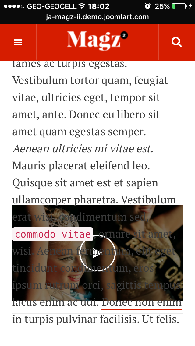
December 30, 2015 at 11:02 pm #835462I guess he means that Video player is not resized in mobile or iPad. It just covers items text content.
I also reported this topic.
Check your demo Magz ii with iPad or mobile phone, and visit Video category. Then scroll down. You will see that Video screen is not resized.
Adam M
- Join date:
- May 2014
- Posts:
- 5159
- Downloads:
- 33
- Uploads:
- 66
- Thanks:
- 95
- Thanked:
- 1271 times in 1235 posts
January 1, 2016 at 1:44 am #836312I guess you missunderstood me. Here (attached) is how video page looks like when scrolled down. Neither video nor text is visible. There is no sense to have this effect if it does not work.
Is it possible to hide this (resizing) effect for ipad and mobile? This was a question of the user who started this thread. If resizing cant work , its betterc not to have such feature.
Or maybe there is solution to be found?
Adam M
- Join date:
- May 2014
- Posts:
- 5159
- Downloads:
- 33
- Uploads:
- 66
- Thanks:
- 95
- Thanked:
- 1271 times in 1235 posts
January 4, 2016 at 2:18 pm #838265HI, happy new year!
In attached pictures made in iPhone you can see the space under each article. and Second issue: Player screen which is covered by Item text. In some pages just 50% of the player screen is shown. Even in such condition, player is covered by text. If the model how the player moves, is the youtube, than it must be ON the text. Not under the text.((Please note: I’m talking about Demo website. (I will start working on Magz II on my own server in coming days))
P>S. Support page does not attach more than 1 file. I’m sending them in separated posts.January 4, 2016 at 2:22 pm #838269See the rest of photos
Adam M
- Join date:
- May 2014
- Posts:
- 5159
- Downloads:
- 33
- Uploads:
- 66
- Thanks:
- 95
- Thanked:
- 1271 times in 1235 posts
January 5, 2016 at 3:51 pm #839181Screenshots attached are made by iPhone 5.
The same problem is if browsed by iPad mini.I uses Safari in both , iPhone and iPad.
Player is overlaid with Text in iPhone and iPad.
As I mentioned, if NO solution for this issue found, I prefer to hide "resizing video effect" for mobile devices. Is it possible?Adam M
- Join date:
- May 2014
- Posts:
- 5159
- Downloads:
- 33
- Uploads:
- 66
- Thanks:
- 95
- Thanked:
- 1271 times in 1235 posts
AuthorPostsThis topic contains 21 replies, has 3 voices, and was last updated by
Adam M 9 years ago.
We moved to new unified forum. Please post all new support queries in our New Forum
melih

