With this latest version of T3v3 framework, we have introduced the responsive layout configurations. Simply put, now its possible to plan your responsive layouts (different layouts for mobile, handheld, tablets and so on) very easily. Normal users will find it very handy as it does away with the need of coding at the same time developers can dive deep and customize the layouts, we have made it very simple to understand and update.
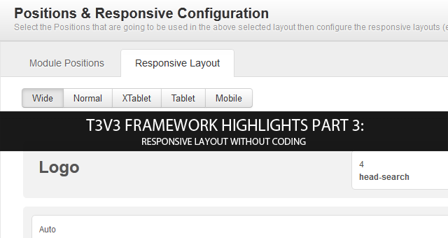
T3v3 Framework highlights part 3: Responsive Layout without coding
For the last two releases of T3v3 Framework stable version 1.0.0 and 1.0.1, we have focused working on:
- Responsive Layout Configuration without coding for normal users, and
- The easiest possibilities for developers to manually configure the layout with coding
If you have not been keeping track of T3v3 framework development, you can know more about the layouts, module positions configuuration in our earlier blog post.
- T3v3 Beta 2 Release: Introducing the Layout
- T3v3 Framework highlights part 1 - Layout explained (video)
Responsive Layout Configuration
The usual procedure to make your template responsive is dealing with CSS styles, decide on which modules to show and where, update module positions and width. Its a painful process and we understand it. This is why we have improved the layout configurations to include responsive layout controls, makes it easier for you to control your template layouts as well as makes it easier for us too in rolling out feature rich flexible templates.
We support 5 Responsive layout options : Wide, Normal, Xtablet, Tablet and Mobile.
But what can you do realistically?
- Add / remove module positions
Update the module positions you wish to show on the responsive layouts. Once done, you can proceed to next step. - Enable/Disable module positions
Yes, You can now enable/disable a specific module positions to be displayed in one layout or hidden in another. - Resize module position in spotlight block (only in spotlight block)
Want the module position to be smaller in desktop but bigger on mobile and tablet? Feel free to make adjustment by simply drag and resize according to your desire.
Check this short video out for a better visualization on Responsive Layout:
Manually Customize the Layout (developer level)
Would like to do a different layout instead of all the layouts that are included in T3v3? Here is how you start to make yourself a new layout:
- Create a php layout file under your_site_folder/templates/ja_t3v3_blank/tpls folder (as each layout would need a php layout file for itself). TIP: clone out one of the current php layout file here, rename and edit from it, it’s always tough to start from scratch.
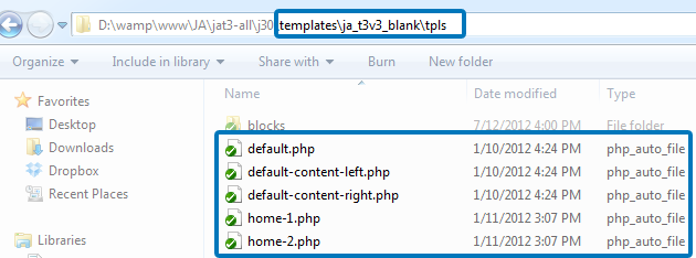
Create new layout file in this folder
- Define blocks that you would like your layout to have. Maybe, one spotlight block for your entire site isn’t enough. You can make 2 or 3 of them by defining it here.
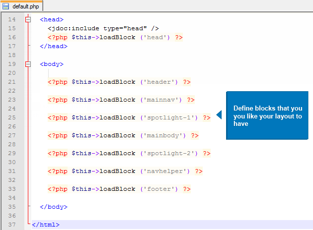
Define blocks for your new layout with the existing block definitions
- If you want more blocks, you can always define more under your_site_folder/templates/ja_t3v3_blank/tpls/blocks. We have our default and most common used one here in the folder, but its easy to define your own type of block. Each block needs its own php file, hence feel free to clone an existing php file here, rename and edit it accordingly to your need.
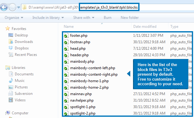
Define more blocks here
- Customize your block. You have your block name and php file made up, one more step away from done: it’s time to configure it. Update the module positions for your block to display.
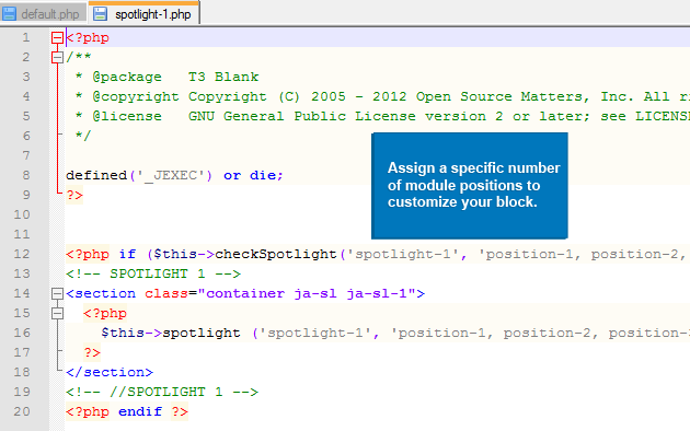
Customize your block
For more code format on layout customization, please read more at our Layout Documentation section.
Manual work always sounds intimidating at first, but no hassle just follow those above steps and you’ll be fine.
This is a wrap on our Layout Customization feature. We are still preparing for more features to come, promising for more fun and excitement. Until then, bookmark our Blog for our next T3v3 blog series.

