saguaros Please let me know which CSS ? I did not get it. I am not keeping any menu color to white. I do not want to increase the breakpoint. What I want is to have a proper mobile menu. I have similar issue in deskptop view where u asked me to change top margin.
For custom CSS code, you can put into this file: /templates/ja_stark/local/css/custom.css
saguaros ok but how this is going to solve my problem of menu line cutting other items as per my image ?
sachinsehdev Is above code not working?
Could you share screenshot of how it should be?
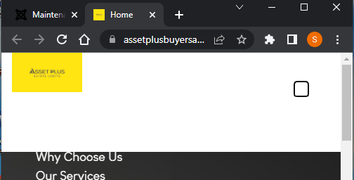
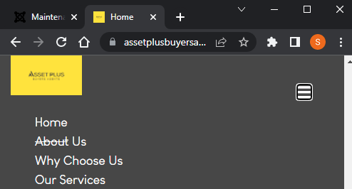
saguaros Please see the screenshot above: Line under Home is cutting Why Choose us menu. Also there is a lot of white space. Please go to the site and change the the window as in mobile and check the menu background color it is coming as white. You can not see Home menu
sachinsehdev It due to the margin top that you set for the hero section in custom.css file.
I updated this to fix it:
@media (max-width: 486px){
body.nav-open div#t4-hero {margin-top: -243px !important;}
body.nav-open div#t4-hero .t4-section-inner.container {margin-top: 60px;}
}
Kindly check.
saguaros .
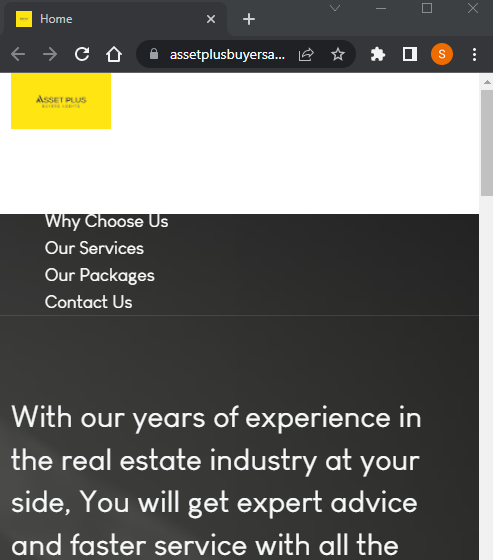
still getting this white space in mobile menu
Still menu bottom line is cutting other words
sachinsehdev
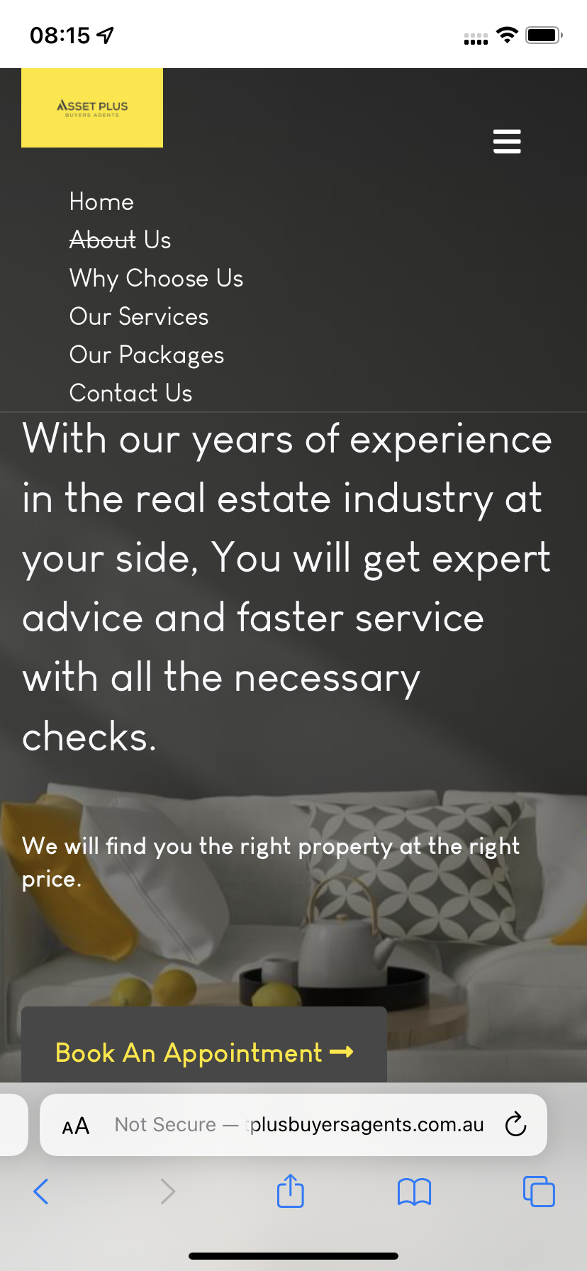
It looks fine when I check in my iphone device:
saguaros Mate Please check About us . It looks strike out to me.
Regards Sachin
It's bottom border of menu link, I disabled it with updated css, kindly check.
saguaros Great thanks. Couple of issues though: 1. When I try to click on About us then Why choose us is getting selected, Can we please increase padding so that it does not happen or happy for you to provide me a solution.
In web browser, after you resize browser, you need to refresh so it can get the correct style. This is recommended by all browsers when you test that way 🙂
Hey Mate, i just want to give a big shshout to say thank you for all of your help and support. it is sometimes very difficult with new tools as users have abig learningcurve and thetool also need improvements. I have many cases open because of that and you are doing agreat job.
saguaros I think issue is still there in tablet view
My above suggestion is used for mobile view.
If you want to change for tablet view, you will need to edit with Media Queries, something like this:
@media (min-width: 768px) and (max-width: 1199.98px) {
/*your custom CSS goes here*/
}
saguaros Thank you