

Viewing 2 posts - 1 through 2 (of 2 total)
-
AuthorPosts
-
 slepoy
Friend
slepoy
Friend
slepoy
- Join date:
- January 2013
- Posts:
- 103
- Downloads:
- 10
- Uploads:
- 67
- Thanks:
- 19
- Thanked:
- 7 times in 5 posts
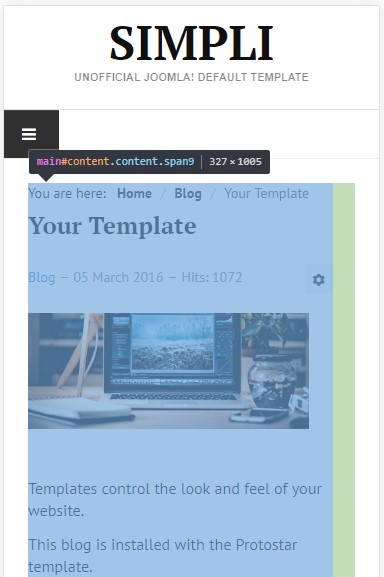
July 22, 2017 at 3:47 pm #1050630Hello. I installed Ja Simpli and published right-sidebar.
Can you please make template more mobile* friendly? There is some padding/margin that, I suppose, should be removed. More info at the screenshot. _ also problem appear in ipad portrait view
*Is it possible to apply fix in next version?
Thanks.
Temporary I had to add style to CSS (not sure is it a good idea):
@media only screen and (max-width: 767px){ .content { padding-right: 0; } .sidebar { padding-right: 0; } }-
This topic was modified 6 years, 9 months ago by slepoy.
-
This topic was modified 6 years, 9 months ago by slepoy.
-
This topic was modified 6 years, 9 months ago by slepoy.
-
This topic was modified 6 years, 9 months ago by slepoy.
-
This topic was modified 6 years, 9 months ago by slepoy.
-
This topic was modified 6 years, 9 months ago by slepoy.
-
AuthorPosts
Viewing 2 posts - 1 through 2 (of 2 total)This topic contains 1 reply, has 2 voices, and was last updated by
Saguaros 6 years, 9 months ago.
We moved to new unified forum. Please post all new support queries in our New Forum
Jump to forum