-
AuthorPosts
-
karocki Friend
karocki
- Join date:
- July 2011
- Posts:
- 10
- Downloads:
- 0
- Uploads:
- 0
- Thanks:
- 3
- Thanked:
- 1 times in 1 posts
February 23, 2014 at 8:32 am #195106Hi All,
Busy using the portfolio template style and noticed that the image resizing for the responsive layout is a bit odd. When your screen size gets to about 960px or slightly less it massively increases the images sizes (from about 350px to about 720px).
I am wanting to keep them smaller to keep file sizes down but cant seem to work out how to change this so the images don’t increase so much.
Any ideas?
 Ninja Lead
Moderator
Ninja Lead
Moderator
Ninja Lead
- Join date:
- November 2014
- Posts:
- 16064
- Downloads:
- 310
- Uploads:
- 2864
- Thanks:
- 341
- Thanked:
- 3854 times in 3563 posts
February 24, 2014 at 3:16 pm #524138Please try this workaround:
Open the templates/purity_iii/css/layouts/porfolio.css file and add new css rule to the end of file:
   @media  (min-width: 800px) and (max-width: 960px) {

	.porfolio-items .item-image img {

	  width: auto !important;

	  padding: 0 !important;

	}

}
karocki
- Join date:
- July 2011
- Posts:
- 10
- Downloads:
- 0
- Uploads:
- 0
- Thanks:
- 3
- Thanked:
- 1 times in 1 posts
February 25, 2014 at 5:37 pm #524330Hi there,
Thanks for the assistance but didn’t make a difference. The first line “@media (min-width: 800px) and (max-width: 960px) {” appears greyed out so not sure if thats the issue.
Anymore ideas?
Ninja Lead
Moderator
Ninja Lead
- Join date:
- November 2014
- Posts:
- 16064
- Downloads:
- 310
- Uploads:
- 2864
- Thanks:
- 341
- Thanked:
- 3854 times in 3563 posts
February 27, 2014 at 1:27 am #524535I would need to take a closer look at your site. Please pm me URL of your site, admin access and FTP account. I will help you out
Ninja Lead
Moderator
Ninja Lead
- Join date:
- November 2014
- Posts:
- 16064
- Downloads:
- 310
- Uploads:
- 2864
- Thanks:
- 341
- Thanked:
- 3854 times in 3563 posts
March 10, 2014 at 1:57 am #525964I have fixed the problem directly on your site. Here is my workaround:
Add following rule to the templates/purity_iii/css/custom.css file:
@media (min-width: 321px) and (max-width: 960px) {

	.blog .blog-item .item-image img {

	  width: auto !important;

	  padding: 0 !important;

	}

}
Please check again and let me know if it helps.
March 19, 2014 at 3:50 pm #527360Hello,
I got a similar issue with Onepage template when screen width is beween 1020px and 1200px and mouse is over the image (colored). The image width is 240px instead od 213px. How to fix it?
Ninja Lead
Moderator
Ninja Lead
- Join date:
- November 2014
- Posts:
- 16064
- Downloads:
- 310
- Uploads:
- 2864
- Thanks:
- 341
- Thanked:
- 3854 times in 3563 posts
March 20, 2014 at 10:35 am #527467<em>@cadinterop 417159 wrote:</em><blockquote>Hello,
I got a similar issue with Onepage template when screen width is beween 1020px and 1200px and mouse is over the image (colored). The image width is 240px instead od 213px. How to fix it?</blockquote>
Please send me URL of your site. Any screenshot on the issue would be helpful. I will help you out then.
March 22, 2014 at 3:13 am #527684I have somewhat the same issue in Purity iii. I’ve added a unordered list and styled it for the desktop browsers with no issue, but the media screen properties are ignored. I was editing the css in the t3asset directory but with finding this article have moved to the template custom css file. :-[
March 24, 2014 at 8:38 am #527811<em>@Ninja Lead 417296 wrote:</em><blockquote>Please send me URL of your site. Any screenshot on the issue would be helpful. I will help you out then.</blockquote>
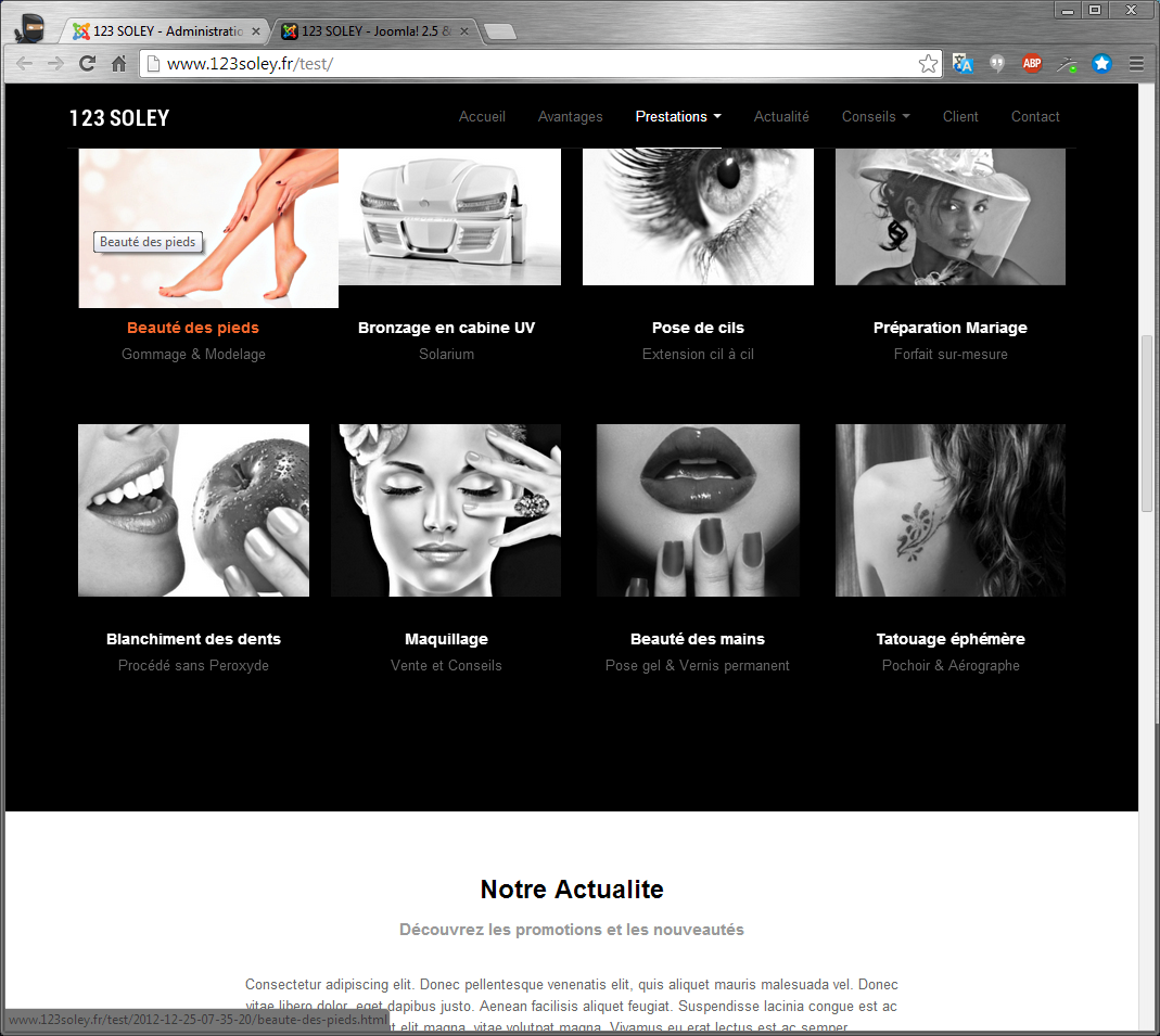
http://www.123soley.fr/testNinja Lead
Moderator
Ninja Lead
- Join date:
- November 2014
- Posts:
- 16064
- Downloads:
- 310
- Uploads:
- 2864
- Thanks:
- 341
- Thanked:
- 3854 times in 3563 posts
March 31, 2014 at 3:42 am #528687<em>@cadinterop 417772 wrote:</em><blockquote>http://www.123soley.fr/test
</blockquote>Apologies for this late response, somehow I missed this thread. You can fix the problem on your site site as follows:
Open templates/ja_onepage/css/template.css file,
Change
img.jaimage,

div.circle_image .img-grayscale,

.clients .img-grayscale {

  max-width: none 9 !important;

  filter: gray 9;

}
To
img.jaimage,

div.circle_image .img-grayscale,

.clients .img-grayscale {

  max-width: none 9 !important;

  filter: gray 9;

  max-width: none !important;

}
AuthorPostsViewing 10 posts - 1 through 10 (of 10 total)This topic contains 10 replies, has 4 voices, and was last updated by
Ninja Lead 10 years ago.We moved to new unified forum. Please post all new support queries in our New Forum
Purity III – Portfolio image sizes
Viewing 10 posts - 1 through 10 (of 10 total)