-
AuthorPosts
-
dumpyman Friend
dumpyman
- Join date:
- December 2012
- Posts:
- 13
- Downloads:
- 0
- Uploads:
- 6
- Thanks:
- 5
- Thanked:
- 2 times in 1 posts
February 21, 2014 at 4:47 pm #195053Article images width not resized. The bug displayed on joomlart site with a original template and settings. Android 4.0, chrome browser.:-[
Saguaros Moderator
Saguaros
- Join date:
- September 2014
- Posts:
- 31405
- Downloads:
- 237
- Uploads:
- 471
- Thanks:
- 845
- Thanked:
- 5346 times in 4964 posts
February 24, 2014 at 8:11 am #524042Could you tell me the name of the device that you face this issue? also paste the URL of page where problem can be seen here. I tried to check one of article: http://joomla-templates.joomlart.com/purity_iii/index.php/layout/new-layouts/magazine/90-t3-framework-and-bootstrap-3/105-best-joomla-template-featuring-easyblog in my samsung device, the image looks fine.
March 26, 2014 at 4:02 am #528162can i add an external image resizing application to the device, so it will work. there are so many image resizing plugin that can be considered to added into the device. hope it helps.
gt35m Friend
gt35m
- Join date:
- February 2014
- Posts:
- 62
- Downloads:
- 0
- Uploads:
- 14
- Thanks:
- 13
- Thanked:
- 13 times in 2 posts
March 29, 2014 at 6:15 pm #528605<em>@Saguaros 413008 wrote:</em><blockquote>Could you tell me the name of the device that you face this issue? also paste the URL of page where problem can be seen here. I tried to check one of article: http://joomla-templates.joomlart.com/purity_iii/index.php/layout/new-layouts/magazine/90-t3-framework-and-bootstrap-3/105-best-joomla-template-featuring-easyblog in my samsung device, the image looks fine.</blockquote>
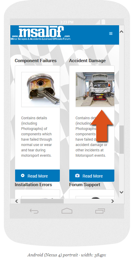
Sorry to hijack the thread, but I have the same problem when using the Nexus 7. Test site: http://test.msalof.com
Steve
Saguaros
- Join date:
- September 2014
- Posts:
- 31405
- Downloads:
- 237
- Uploads:
- 471
- Thanks:
- 845
- Thanked:
- 5346 times in 4964 posts
April 1, 2014 at 3:42 am #528883Hi Steve,
Do you face the same issue in any other common Android devices? I have no Nexus 7 for testing at the moment. I tried with: http://www.responsinator.com/?url=http%3A%2F%2Ftest.msalof.com%2F but it seems to work fine now.
April 3, 2014 at 1:04 pm #529357Hi.
Sorry to interupt in to the tread. I`m faceing the same problem with my web site. Using Samsung Phone, and the web site is running with Ja Anion template.
Web site … http://www.modellflyklubben.nogt35m
- Join date:
- February 2014
- Posts:
- 62
- Downloads:
- 0
- Uploads:
- 14
- Thanks:
- 13
- Thanked:
- 13 times in 2 posts
April 3, 2014 at 1:50 pm #529363<em>@Saguaros 419143 wrote:</em><blockquote>Hi Steve,
Do you face the same issue in any other common Android devices? I have no Nexus 7 for testing at the moment. I tried with: http://www.responsinator.com/?url=http%3A%2F%2Ftest.msalof.com%2F but it seems to work fine now.</blockquote>
Hello Saguaros,
Sorry for the delay in replying, only just saw your reply. I have a better example of the problem on another site I am working on –> http://www.responsinator.com/?url=http%3A%2F%2Fnew.emoticonit.com%2Findex.php%2Four-products-and-services-in-lincolnshire%2Fwebsite-design-maintenance-ad-hoc-updates-and-other-web-services-lincolnshire
If you scroll down to the Nexus 4, you will see the sizing problem I’m experiencing! 🙂
Thanks for your help, much appreciated! 🙂
gt35m
- Join date:
- February 2014
- Posts:
- 62
- Downloads:
- 0
- Uploads:
- 14
- Thanks:
- 13
- Thanked:
- 13 times in 2 posts
April 3, 2014 at 2:03 pm #529365<em>@gisetstad 419712 wrote:</em><blockquote>Hi.
Sorry to interupt in to the tread. I`m faceing the same problem with my web site. Using Samsung Phone, and the web site is running with Ja Anion template.
Web site … http://www.modellflyklubben.no</blockquote>Hello gisetstad,
Looking at your website, the first thing I’ve noticed is that your images are not responsive, so protrude out the side when viewed on tablets etc. look here –> http://www.responsinator.com/?url=http%3A%2F%2Fwww.modellflyklubben.no%2F
You could try adding the following ‘class’ to your images to see if that helps;
class="img-responsive"Or if you’re using a gallery, try and find one on the JED which is responsive.
Another option is to ‘hide’ the images on extra small screens (mobile devices) by using the following class;
class="hidden-xs"Hope this helps! 😀
Saguaros
- Join date:
- September 2014
- Posts:
- 31405
- Downloads:
- 237
- Uploads:
- 471
- Thanks:
- 845
- Thanked:
- 5346 times in 4964 posts
April 3, 2014 at 2:04 pm #529366@gisetstad : You’re using iPhone layout for mobile device so that you can open file: /templates/ja_anion/css/iphone/template.css and add this css rule:
.blog .article_row .article_column img {

    width: 100%;

}
Then clean JAT3 cache.
Saguaros
- Join date:
- September 2014
- Posts:
- 31405
- Downloads:
- 237
- Uploads:
- 471
- Thanks:
- 845
- Thanked:
- 5346 times in 4964 posts
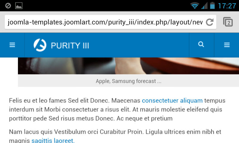
April 3, 2014 at 2:13 pm #529367@gt35m: as I can see that the Nexus 4 has width of 384px and through Firebug editor, I see the width of image is ~337px. It seems to display normally: http://prntscr.com/36modb
gt35m
- Join date:
- February 2014
- Posts:
- 62
- Downloads:
- 0
- Uploads:
- 14
- Thanks:
- 13
- Thanked:
- 13 times in 2 posts
April 3, 2014 at 2:44 pm #529371@saguaros : That’s strange because the original image is only 400H x 266W to start with! :laugh:
You can recreate the problem by just resizing your desktop browser, and you will see the image grow larger! – It’s not a show stopper for me, but does make the images look bad.
I’ve experienced the same problem as @dummyman, but that was through using a third party add on (FavEffects I think) which resized the text but not the images, and certainly something I do not blame JoomlArt for !! :laugh:
I’ve attached a screenshot showing the problem for anyone else who may have the same problem with this extension;
Kind regards, Steve 🙂
Saguaros
- Join date:
- September 2014
- Posts:
- 31405
- Downloads:
- 237
- Uploads:
- 471
- Thanks:
- 845
- Thanked:
- 5346 times in 4964 posts
April 4, 2014 at 3:14 am #529449Hi Steve,
Could you update URL of page where I can see images as in your screenshot?
April 4, 2014 at 7:43 am #529487<em>@Saguaros 419725 wrote:</em><blockquote>@gisetstad : You’re using iPhone layout for mobile device so that you can open file: /templates/ja_anion/css/iphone/template.css and add this css rule:
.blog .article_row .article_column img {

    width: 100%;

    height: auto;

}
Then clean JAT3 cache.</blockquote>
Thanks a lot. This help for the width of the img. but not for the height, Is there any way to also adjust the height ?
— forget the question, I figure out that you can add on ” height: auto; ” that make the img. view perfect.
AuthorPostsViewing 13 posts - 1 through 13 (of 13 total)This topic contains 13 replies, has 5 voices, and was last updated by
gisetstad 10 years ago.
We moved to new unified forum. Please post all new support queries in our New Forum
Jump to forum

