-
AuthorPosts
-
Ch1vpH Friend
Ch1vpH
- Join date:
- February 2016
- Posts:
- 299
- Downloads:
- 21
- Uploads:
- 128
- Thanks:
- 29
- Thanked:
- 1 times in 1 posts
July 19, 2017 at 11:57 am #1049803Hi there – My site that I’m currently testing this menu setup on is: http://ch1vph.xyz/ri2k/
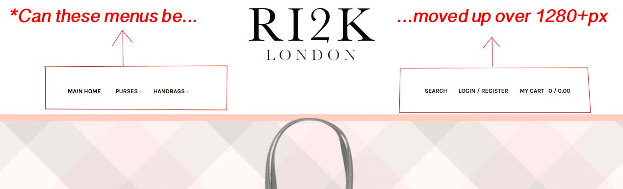
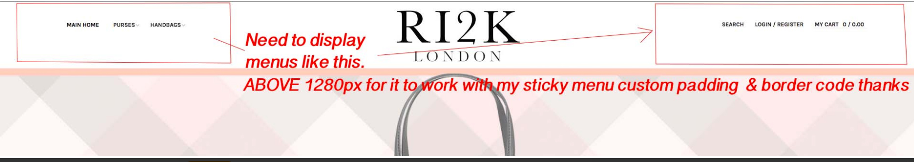
My client now wants the ‘menu items’ sat next to the main logo (as it originally was) so I’ve backtracked through every step I took to have the menu items display under the logo! (As in this post) But I DO want to keep the menus under the main logo but ONLY under 1280px’s
After 1280px I need to have Menu Items to display next to the logo on either side as it seems to already when viewing on screen over 1600’ish pixels…
I have attached some screenshots explaining what I’m after doing just need a little help moving them!
Thanks
-
This topic was modified 6 years, 9 months ago by
Ch1vpH.
-
This topic was modified 6 years, 9 months ago by
 Pankaj Sharma
Moderator
Pankaj Sharma
Moderator
Pankaj Sharma
- Join date:
- February 2015
- Posts:
- 24589
- Downloads:
- 144
- Uploads:
- 202
- Thanks:
- 127
- Thanked:
- 4196 times in 4019 posts
July 20, 2017 at 2:11 am #1049966Hi
Open
find and remove this code
make sure it work only for the screen size mentioned in the code.
If you want to customised it you can create new media query style code as shared in the below code in and override it via custom.css file@media (max-width: 1679px) and (min-width: 992px) {body.header-horizontal .logo { float: none; border-bottom: 1px solid #e8e8e8; margin-left: 0; width: 100%; }}I checked your site has a lot of chanes in the css, I am afraid if you will make more custom changes it reflect the other codes make make the view complicated.
Regards
Ch1vpH
- Join date:
- February 2016
- Posts:
- 299
- Downloads:
- 21
- Uploads:
- 128
- Thanks:
- 29
- Thanked:
- 1 times in 1 posts
July 20, 2017 at 11:27 am #1050150Hi there,
At the start of your reply you mentioned to
Open …………………….?
find and remove this code………………………?
make sure it work only for the screen size mentioned in the code.Could you let me know if I’m missing the information above please.
Pankaj Sharma
Moderator
Pankaj Sharma
- Join date:
- February 2015
- Posts:
- 24589
- Downloads:
- 144
- Uploads:
- 202
- Thanks:
- 127
- Thanked:
- 4196 times in 4019 posts
July 21, 2017 at 1:53 am #1050296Hi
Here is the path
/templates/ja_brickstore/local/css/themes/dark-peach/template.cssRegards
Ch1vpH
- Join date:
- February 2016
- Posts:
- 299
- Downloads:
- 21
- Uploads:
- 128
- Thanks:
- 29
- Thanked:
- 1 times in 1 posts
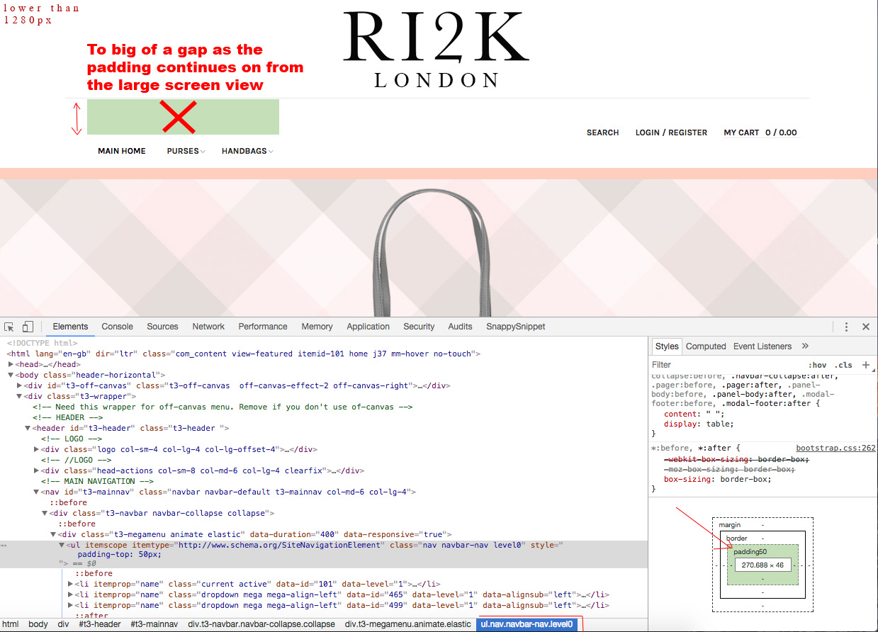
July 21, 2017 at 7:15 pm #1050489Ok thats great works perfectly now on x4 different device sizes!!!!
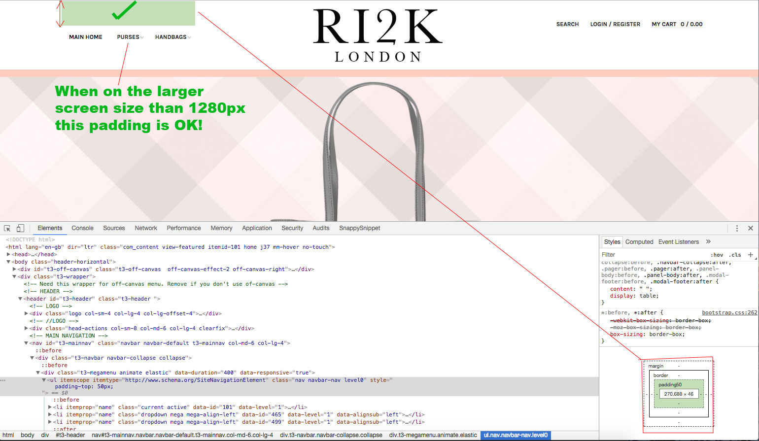
The only small but noticeable issue now, is that the menus in my large screen above 1280px mode do not line up in the middle of the nav-bar correctly
I have added some padding to them (which is fine in the large screen view) but when I decrease the screen size to below 1280px the padding stays with the nav-bar menu items and creates a gap!
My question is; can I have the padding just apply to the ‘nav-bar menu-items’ only on a screen size of 1280px and above, so the padding doesn’t create this gap the lower screen size.
Thanks again!
 Pankaj Sharma
Moderator
Pankaj Sharma
Moderator
Pankaj Sharma
- Join date:
- February 2015
- Posts:
- 24589
- Downloads:
- 144
- Uploads:
- 202
- Thanks:
- 127
- Thanked:
- 4196 times in 4019 posts
July 24, 2017 at 1:36 am #1050879Hi
I have not found any padding in the normal view: http://prntscr.com/fzeztn
http://prntscr.com/fzezxm
Its showing fine and the padding is normal.Regards
Ch1vpH
- Join date:
- February 2016
- Posts:
- 299
- Downloads:
- 21
- Uploads:
- 128
- Thanks:
- 29
- Thanked:
- 1 times in 1 posts
July 24, 2017 at 8:59 pm #1051161Hi there,
Sorry forgot to mention as they were out of place I hadn’t actually inserted the code and was only testing.
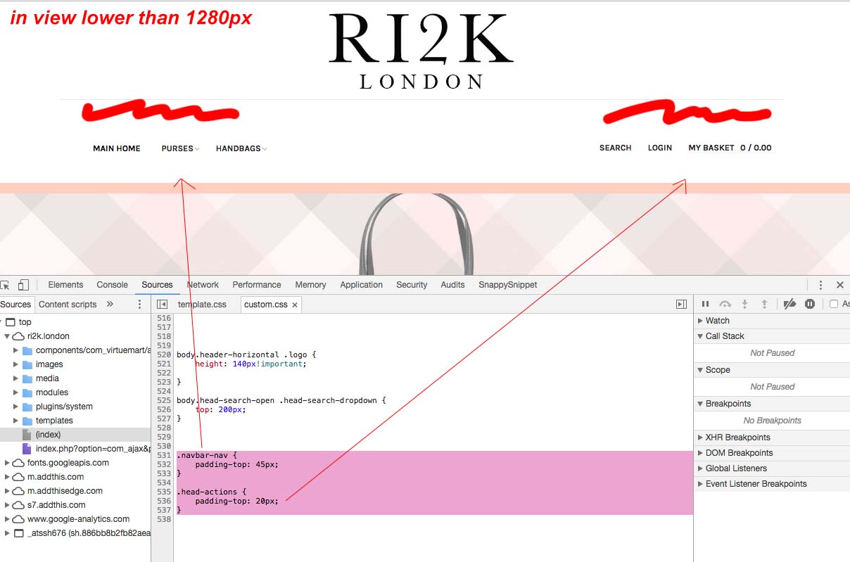
But I have now added the code below to the give the menus (either side of the logo) some extra padding to look more centered on the large screen view, but you can now see my issue with this padding in the slightly smaller view…as per screenshot.
The code i used for padding is also below:
.navbar-nav { padding-top: 45px; } .head-actions { padding-top: 20px; }Pankaj Sharma
Moderator
Pankaj Sharma
- Join date:
- February 2015
- Posts:
- 24589
- Downloads:
- 144
- Uploads:
- 202
- Thanks:
- 127
- Thanked:
- 4196 times in 4019 posts
July 25, 2017 at 1:30 am #1051201Hi
I am completely not getting what you want to achieve here sir.
in the screenshot, i can see the padding is applied but its the same padding that is coming from your code.
You have alot of custom work in the css for header part and it creates the other issue when you apply more new codes for padding.Regards
AuthorPostsViewing 8 posts - 1 through 8 (of 8 total)This topic contains 7 replies, has 2 voices, and was last updated by
Pankaj Sharma 6 years, 9 months ago.We moved to new unified forum. Please post all new support queries in our New Forum
Jump to forum
Menu items’ sat next to the main logo ONLY after 1280px
Viewing 8 posts - 1 through 8 (of 8 total)