

-
AuthorPosts
-
Ch1vpH Friend
Ch1vpH
- Join date:
- February 2016
- Posts:
- 299
- Downloads:
- 21
- Uploads:
- 128
- Thanks:
- 29
- Thanked:
- 1 times in 1 posts
October 2, 2017 at 10:59 pm #1065365Hi there,
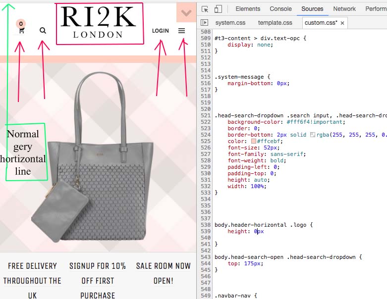
Whilst trying to tweak my logos & menus, I managed to get the menus (in a large view) & icons (in a mobile view) to sit next to the main logo as per 1st image shown on a mobile view – this was instead on the normal main menu setup on the demo (with the grey horizontal line below the logo)
THIS WAS DONE BY USING THE CODE BELOW WITH 0px PIXELS
body.header-horizontal .logo { height: 0px}
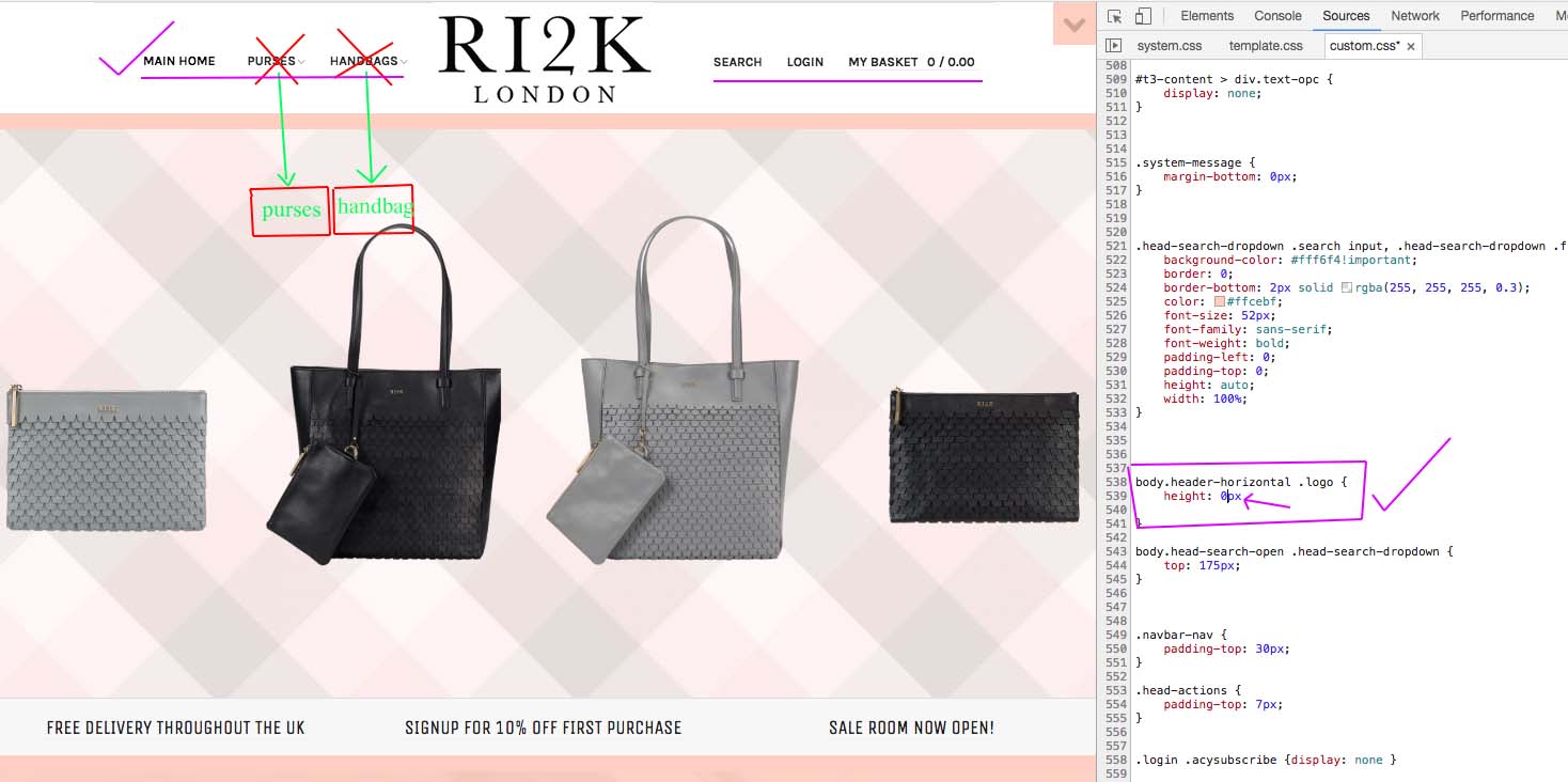
In the second image it shows again how I want it to look & work but because of the code the menus are not clickable because the links are below where the actually menus are…see image two
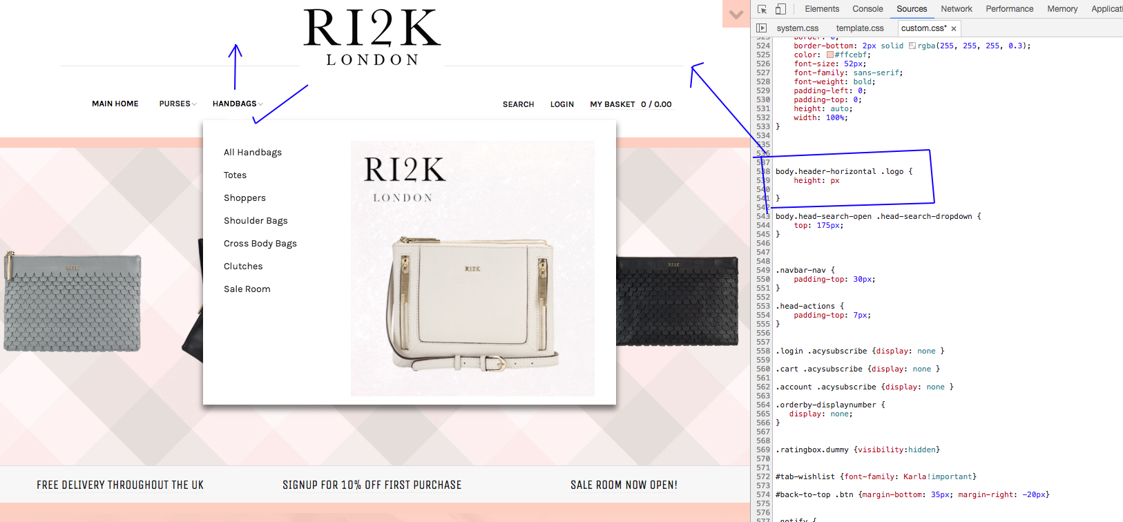
The third image shows the working menus without the code applied but it also does not have menus/icons next to the main logo as I need to have to work well on a mobile view.
Is there any way to accomplish this please…!
-
This topic was modified 6 years, 6 months ago by
Ch1vpH.
-
This topic was modified 6 years, 6 months ago by
Saguaros Moderator
Saguaros
- Join date:
- September 2014
- Posts:
- 31405
- Downloads:
- 237
- Uploads:
- 471
- Thanks:
- 845
- Thanked:
- 5346 times in 4964 posts
October 3, 2017 at 3:13 pm #1065541Hi,
Could you share the URL and login info of your site so I will take a look?
Ch1vpH
- Join date:
- February 2016
- Posts:
- 299
- Downloads:
- 21
- Uploads:
- 128
- Thanks:
- 29
- Thanked:
- 1 times in 1 posts
October 3, 2017 at 5:11 pm #1065549This reply has been marked as private.Saguaros
- Join date:
- September 2014
- Posts:
- 31405
- Downloads:
- 237
- Uploads:
- 471
- Thanks:
- 845
- Thanked:
- 5346 times in 4964 posts
October 5, 2017 at 1:23 am #1065963The logo and the main part are 2 different divs so it’s hard to customize that way, let me check further if it can be changed via layout. And will get back to you.
Saguaros
- Join date:
- September 2014
- Posts:
- 31405
- Downloads:
- 237
- Uploads:
- 471
- Thanks:
- 845
- Thanked:
- 5346 times in 4964 posts
October 12, 2017 at 8:00 am #1067469Hi,
Kindly check the custom css on your site, so many code have wrong syntax (lack of ‘;’ , text is not placed in comment).
Ch1vpH
- Join date:
- February 2016
- Posts:
- 299
- Downloads:
- 21
- Uploads:
- 128
- Thanks:
- 29
- Thanked:
- 1 times in 1 posts
October 12, 2017 at 10:38 pm #1067608Hi there – I’ve removed a lot of old custom code now and added the Semicolons (;) as suggested….
But as for the issue of displaying menus next to the logo on all screen sizes, I do really need this option now & more so than ever….and not just for maximizing the page view on mobile device.
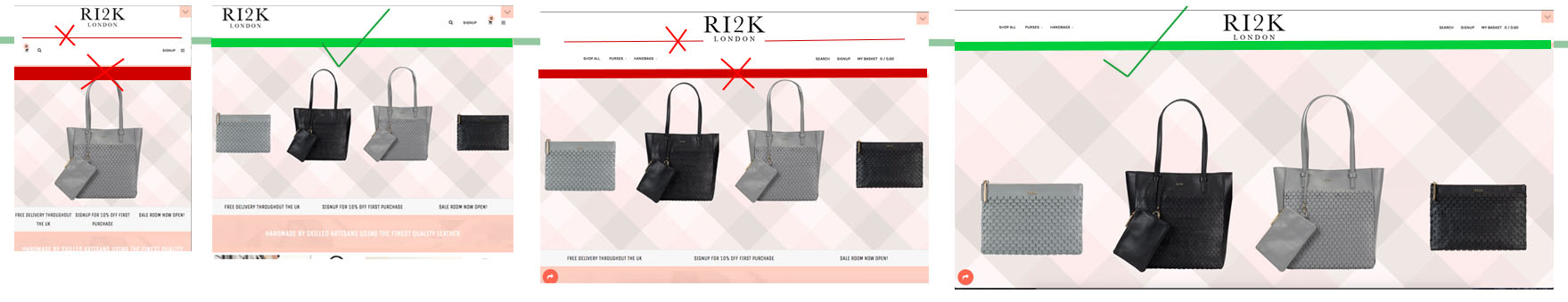
The problem with the current setup (and the horizontal line) is that the page & menus move up and down – (1st image) which is affecting my main banner and the mast-head in other sections (2nd & 3rd images)
Ideally I need the menu to stay the same throughout the site (with the menus next to the logo) so it does not push my main banner & masthead up & down, which is preventing me from changing by main banner!

Saguaros
- Join date:
- September 2014
- Posts:
- 31405
- Downloads:
- 237
- Uploads:
- 471
- Thanks:
- 845
- Thanked:
- 5346 times in 4964 posts
October 13, 2017 at 8:21 am #1067738In this case, you will have to customize much on the mockup and style of this header, the associated file is: root/templates/ja_brickstore/tpls/blocks/header.php
Ch1vpH
- Join date:
- February 2016
- Posts:
- 299
- Downloads:
- 21
- Uploads:
- 128
- Thanks:
- 29
- Thanked:
- 1 times in 1 posts
October 16, 2017 at 11:08 pm #1068209Hi there,
I did try to change this <—header—> & the <—logo—> but I could not work out how to fix this. Can you advise on what’s needed to change, this as using the normal style vertical menu on the template is causing these problems to the masthead when setup on any other page apart from the homepage.
Thankyou.
Saguaros
- Join date:
- September 2014
- Posts:
- 31405
- Downloads:
- 237
- Uploads:
- 471
- Thanks:
- 845
- Thanked:
- 5346 times in 4964 posts
October 19, 2017 at 10:04 am #1068814The logo and the main menu + other section on the right belongs to different div tags in header block, in order to have them in one row, you will need to merge them together and set the associated class and style for it.
AuthorPostsViewing 10 posts - 1 through 10 (of 10 total)This topic contains 9 replies, has 2 voices, and was last updated by
We moved to new unified forum. Please post all new support queries in our New Forum
Jump to forum
Menu icons next to logo on mobile & tablet menus not working…
Viewing 10 posts - 1 through 10 (of 10 total)