-
AuthorPosts
-
moody Friend
moody
- Join date:
- April 2017
- Posts:
- 186
- Downloads:
- 45
- Uploads:
- 40
- Thanks:
- 1
- Thanked:
- 1 times in 1 posts
November 6, 2017 at 8:01 pm #1072733when the screen is in middle size of 980×1280 and 768×1024, such as ipad and mini ipad screen.
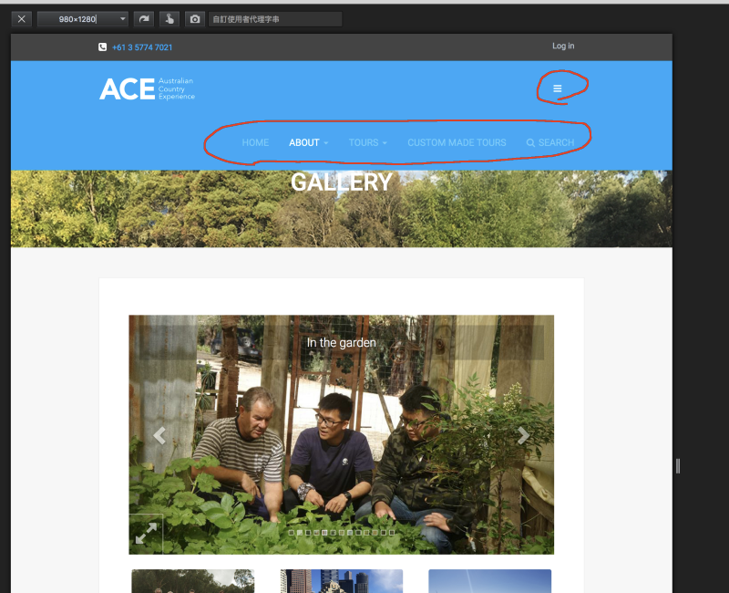
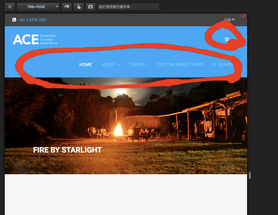
1) the main menu and the canvas button are showing at the same time, (please see image 1a, 1b) how to disable the main menu in middle screen size. (ipad screens)
besides, the text in slider is also not in a stable position and size . how to fix it?
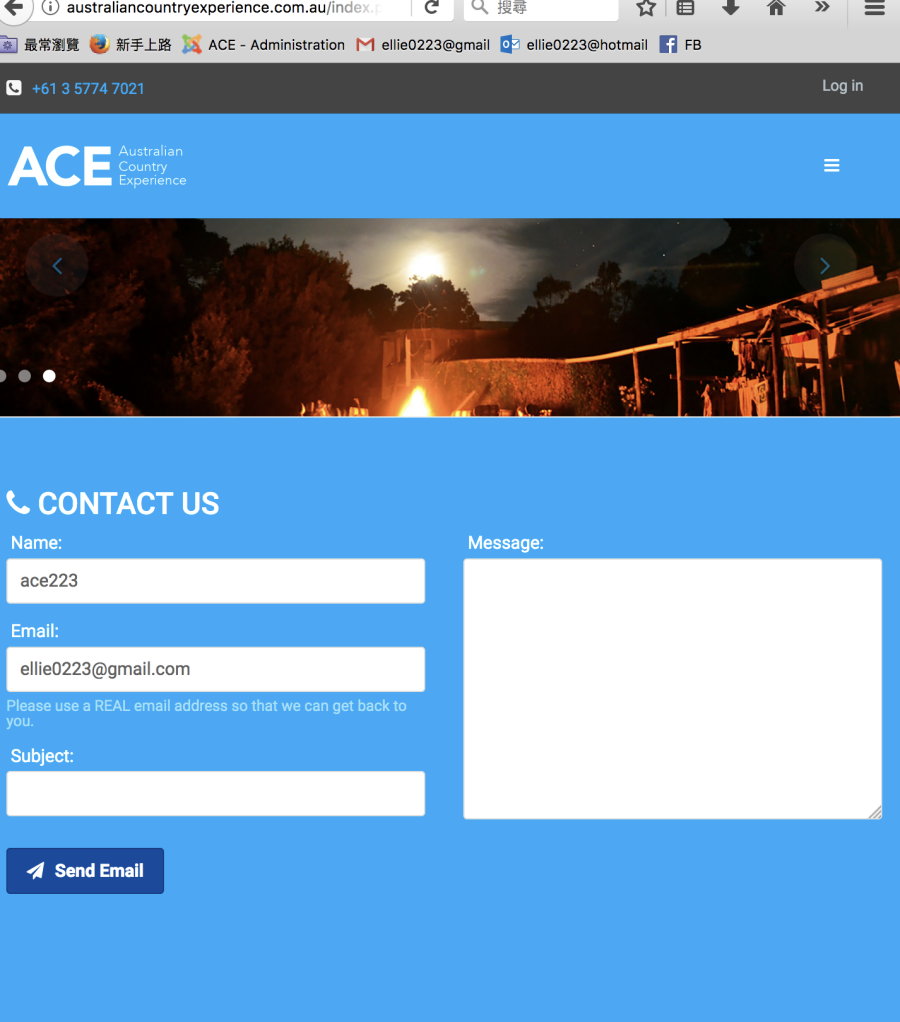
i still want ipad screen can display the text in slideshow. but i need the text to show in right prosition.2) the header and slidershow lacks proportion when the screen size are changing. for example when i drag the the screen width shorter ,the height of slideshow became very narrow . (pls see image2) so the slider background image is not showing properly., how to fix it?
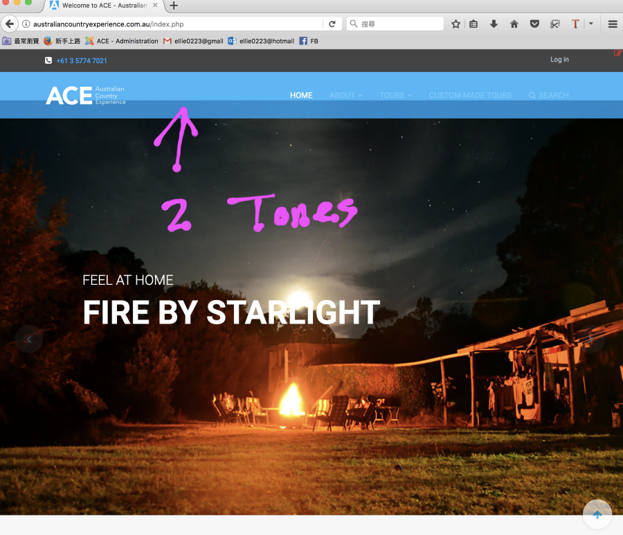
3)and when i drag the screen size with my computer, at a certain size, the header area will looks like having two tones of blue.( probably the slide-show background image top margin is not adjusted properly?- pls see image 3) how to fix it?
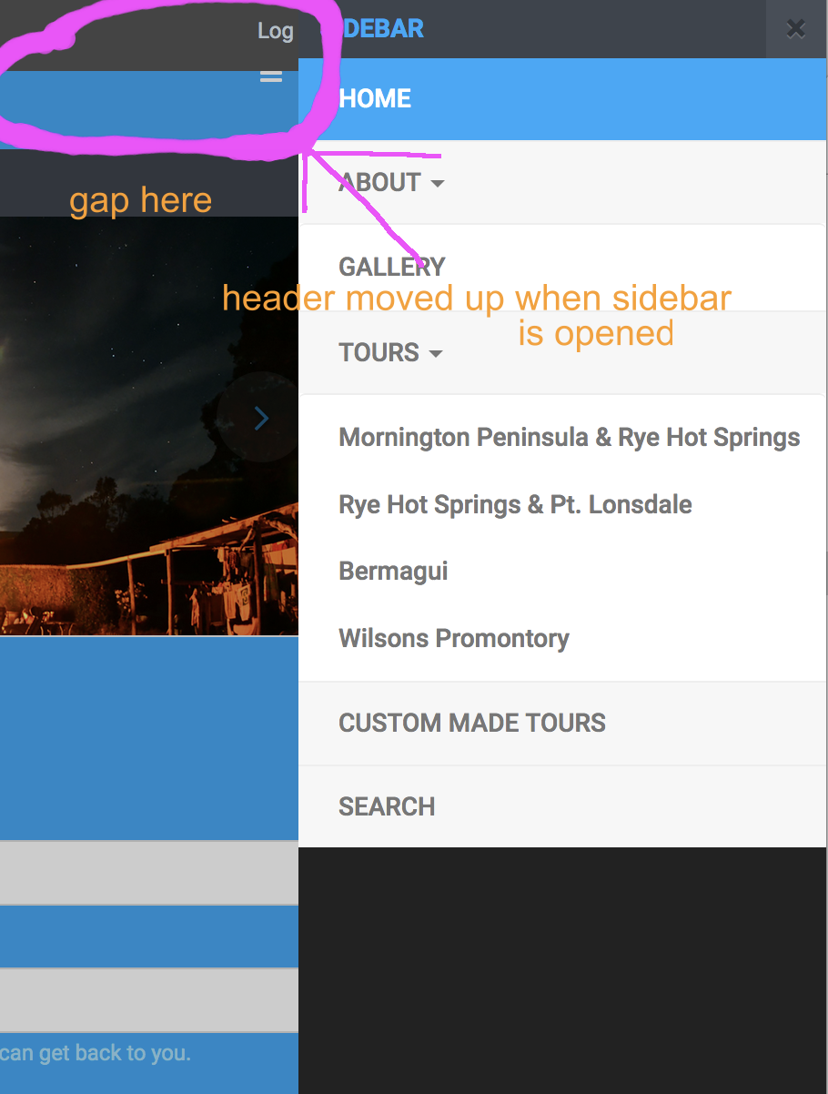
4:the header moves up, when i click the canvas button. (pls see image4) how to make the header stay at the same level of height , not moving up-forward .
-
This topic was modified 6 years, 5 months ago by
moody.
Saguaros Moderator
Saguaros
- Join date:
- September 2014
- Posts:
- 31405
- Downloads:
- 237
- Uploads:
- 471
- Thanks:
- 845
- Thanked:
- 5346 times in 4964 posts
November 8, 2017 at 10:37 am #1073111Hi,
For that off-canvas menu button, you can change breakpoints in LESS file, in which you can decide in which screen size, the button will appear.
Could you share the FTP account also so I will take a look? and pls backup your site first, I may need to compile less to css.
moody
- Join date:
- April 2017
- Posts:
- 186
- Downloads:
- 45
- Uploads:
- 40
- Thanks:
- 1
- Thanked:
- 1 times in 1 posts
November 9, 2017 at 5:46 pm #1073386This reply has been marked as private.moody
- Join date:
- April 2017
- Posts:
- 186
- Downloads:
- 45
- Uploads:
- 40
- Thanks:
- 1
- Thanked:
- 1 times in 1 posts
November 13, 2017 at 6:35 am #1073896This reply has been marked as private.Saguaros
- Join date:
- September 2014
- Posts:
- 31405
- Downloads:
- 237
- Uploads:
- 471
- Thanks:
- 845
- Thanked:
- 5346 times in 4964 posts
November 14, 2017 at 2:24 pm #1074268This reply has been marked as private.moody
- Join date:
- April 2017
- Posts:
- 186
- Downloads:
- 45
- Uploads:
- 40
- Thanks:
- 1
- Thanked:
- 1 times in 1 posts
November 14, 2017 at 9:52 pm #1074341This reply has been marked as private.Saguaros
- Join date:
- September 2014
- Posts:
- 31405
- Downloads:
- 237
- Uploads:
- 471
- Thanks:
- 845
- Thanked:
- 5346 times in 4964 posts
November 15, 2017 at 4:00 pm #1074555Hi,
I update the breadpoint to:
// Point at which the navbar stops collapsing
@grid-float-breakpoint:     @screen-md-min;
and the menu is not showing now on medium screen.
Please check the responsive in real devices, sometime resizing browsers doesn’t bring out the correct result.
moody
- Join date:
- April 2017
- Posts:
- 186
- Downloads:
- 45
- Uploads:
- 40
- Thanks:
- 1
- Thanked:
- 1 times in 1 posts
November 18, 2017 at 7:11 am #1075081This reply has been marked as private.Saguaros
- Join date:
- September 2014
- Posts:
- 31405
- Downloads:
- 237
- Uploads:
- 471
- Thanks:
- 845
- Thanked:
- 5346 times in 4964 posts
moody
- Join date:
- April 2017
- Posts:
- 186
- Downloads:
- 45
- Uploads:
- 40
- Thanks:
- 1
- Thanked:
- 1 times in 1 posts
November 20, 2017 at 10:09 am #1075355This reply has been marked as private.Saguaros
- Join date:
- September 2014
- Posts:
- 31405
- Downloads:
- 237
- Uploads:
- 471
- Thanks:
- 845
- Thanked:
- 5346 times in 4964 posts
November 21, 2017 at 7:17 am #1075603It due to your custom in ‘custom.css’ file. I update the css rule:
.block-slideshow-item .block-bg {
        background-size: 100%!important;
to: background-size: cover
and it’s showing fine now. Kindly check.
moody
- Join date:
- April 2017
- Posts:
- 186
- Downloads:
- 45
- Uploads:
- 40
- Thanks:
- 1
- Thanked:
- 1 times in 1 posts
November 22, 2017 at 4:58 pm #1075972This reply has been marked as private.moody
- Join date:
- April 2017
- Posts:
- 186
- Downloads:
- 45
- Uploads:
- 40
- Thanks:
- 1
- Thanked:
- 1 times in 1 posts
Saguaros
- Join date:
- September 2014
- Posts:
- 31405
- Downloads:
- 237
- Uploads:
- 471
- Thanks:
- 845
- Thanked:
- 5346 times in 4964 posts
November 23, 2017 at 3:10 pm #1076218I updated the main menu and off-canvas icon for you.
For the font size of block title in slideshow, you can open the file:
Look for this declaration: /templates/ja_hotel/acm/slideshow/less/style.less
.block-title {
  font-size: @font-size-h1;

  // Control screen tablet / mobile
  @media screen and (max-width: @screen-sm-max) {
    font-size: @font-size-h3;
    margin-bottom: 0;
    //padding: (@line-height-computed * 2) 0;
  }
}
at this moment, it’s set with font-size-h3 (around 24px), you can change to your desired value.
AuthorPostsThis topic contains 22 replies, has 2 voices, and was last updated by
Saguaros 6 years, 4 months ago.
We moved to new unified forum. Please post all new support queries in our New Forum
Jump to forum

