-
AuthorPosts
-
kella@youngerusa.com Friend
kella@youngerusa.com
- Join date:
- January 2016
- Posts:
- 65
- Downloads:
- 46
- Uploads:
- 23
- Thanks:
- 9
January 25, 2016 at 9:21 pm #868239I would like to have this image (see link below) cover the blue on both the left and right. I have the image set as a background image in the masshead position of the default layout.
This picture shows hero style 1 in full-screen. It also looks the same way when I create a Call-To-Action module.
Can anyone help me figure out what I’m doing wrong here?
 Ninja Lead
Moderator
Ninja Lead
Moderator
Ninja Lead
- Join date:
- November 2014
- Posts:
- 16064
- Downloads:
- 310
- Uploads:
- 2864
- Thanks:
- 341
- Thanked:
- 3854 times in 3563 posts
January 26, 2016 at 4:28 am #868482Hi,
How can I see the screenshot of you mention above? I checked that under the service page but I could not see the background image. If possible, you can add the background image and give me the link, I will check and help you out.
Regards
kella@youngerusa.com
- Join date:
- January 2016
- Posts:
- 65
- Downloads:
- 46
- Uploads:
- 23
- Thanks:
- 9
January 26, 2016 at 1:04 pm #868857I have attached the background image here. I’m sorry about that.
Ninja Lead
Moderator
Ninja Lead
- Join date:
- November 2014
- Posts:
- 16064
- Downloads:
- 310
- Uploads:
- 2864
- Thanks:
- 341
- Thanked:
- 3854 times in 3563 posts
January 27, 2016 at 4:03 am #869405I checked the URLyou provided and that url is using other template not the Uber template.
You can give me the URL of the site running Uber template and besides that, you need to add the image to Call-To-Action module, I will check that and help you to show a full-width image on your site.
kella@youngerusa.com
- Join date:
- January 2016
- Posts:
- 65
- Downloads:
- 46
- Uploads:
- 23
- Thanks:
- 9
January 27, 2016 at 2:25 pm #869760Hello,
I am sorry for the wrong URL. It is youngerusa.com/j3new
I was experiencing this problem even when it was set to a call-to-action module.
However, since then I have installed the Music test site and it seems to be working fine. I am not sure what the problem was, but I am no longer experiencing it.
Thank you for you help!
Ninja Lead
Moderator
Ninja Lead
- Join date:
- November 2014
- Posts:
- 16064
- Downloads:
- 310
- Uploads:
- 2864
- Thanks:
- 341
- Thanked:
- 3854 times in 3563 posts
January 28, 2016 at 2:24 am #870278As I can that image background shows fully under Hero Style-1 module on your site. Is that fine now?
kella@youngerusa.com
- Join date:
- January 2016
- Posts:
- 65
- Downloads:
- 46
- Uploads:
- 23
- Thanks:
- 9
January 29, 2016 at 4:15 pm #871671I changed the position of the module. When it is in masshead position, it is cut on both ends. It seems to do this when I have anything in the masshead position so I am not using that position.
It is now in the acm header position and it shows full screen.
kella@youngerusa.com
- Join date:
- January 2016
- Posts:
- 65
- Downloads:
- 46
- Uploads:
- 23
- Thanks:
- 9
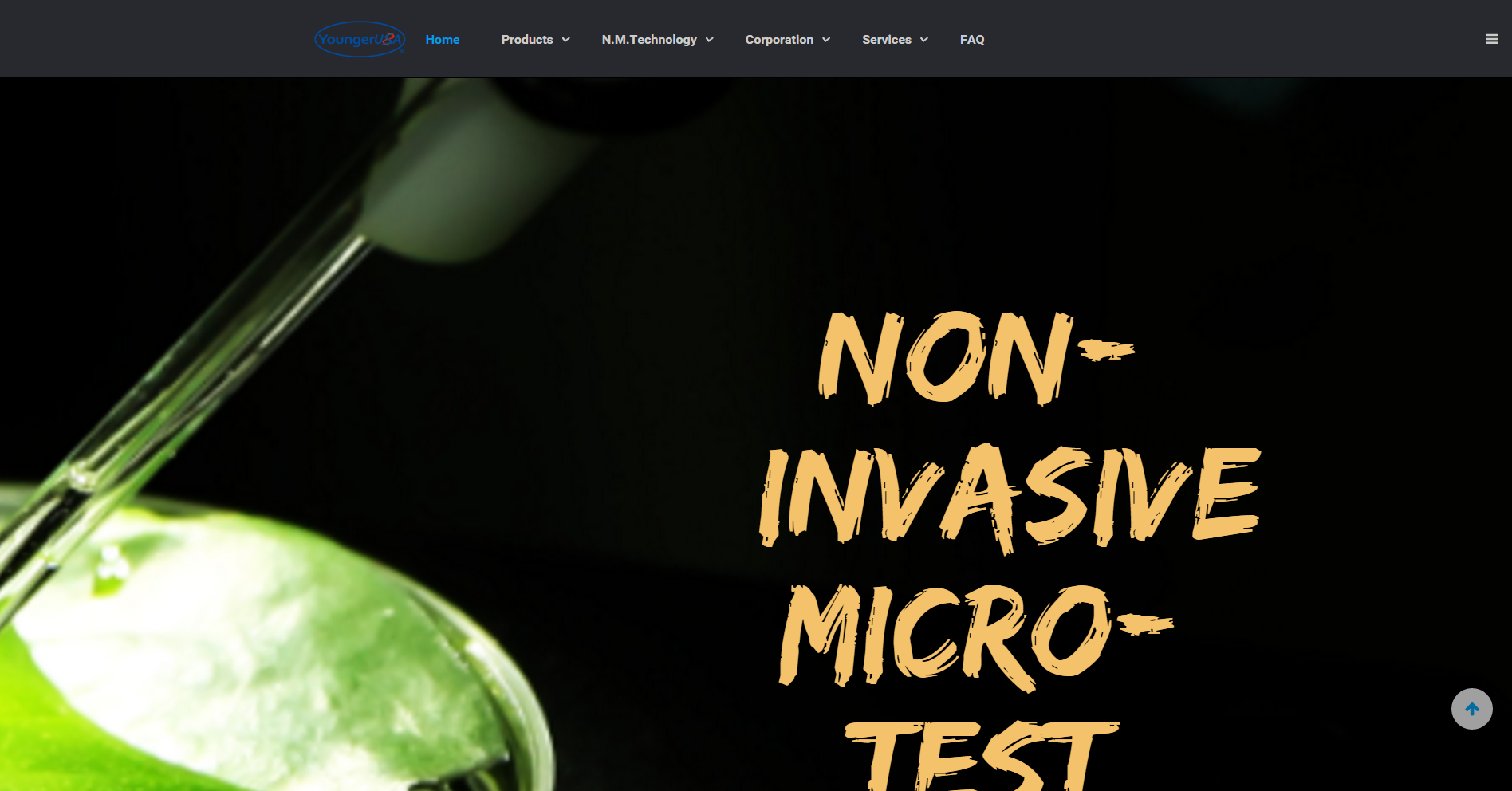
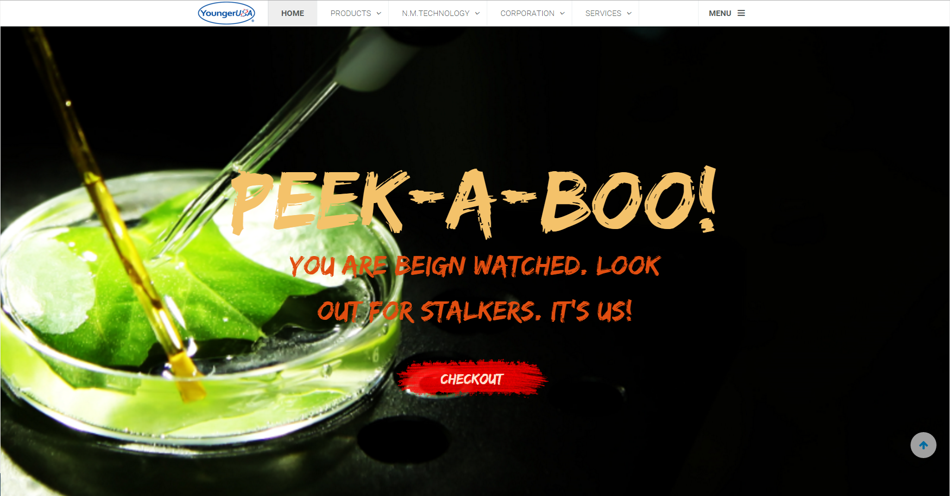
January 29, 2016 at 4:20 pm #871673What size image should I use for a background image in the Uber modules? I have noticed that the size of the image doesn’t shrink to fit the screen so it leaves my backgrounds looking messy. Sometimes the full image doesn’t show up and sometimes the text overlaps the images. I have put some images below.
I would like to create background images that I can be sure will look nice on any size screen. Can anyone help?
1st image is the one I am using as a background
2nd image is hero style 6 showing that my image was blown up so big that you can’t see much of it at all
3rd image is call-to-action style 3 and you can see that the text goes right over my background image. I would like to be able to design my backgrounds in a way so they will not have text over the important pictures.All of these examples are in the ACM header position.
domain: youngerusa.com/j3new

 Ninja Lead
Moderator
Ninja Lead
Moderator
Ninja Lead
- Join date:
- November 2014
- Posts:
- 16064
- Downloads:
- 310
- Uploads:
- 2864
- Thanks:
- 341
- Thanked:
- 3854 times in 3563 posts
February 1, 2016 at 8:57 am #873229Try to use my solution below
Create templates/uber/css/custom.css file and add new rule
.acm-hero {
    background-size: cover !important;
}
kella@youngerusa.com
- Join date:
- January 2016
- Posts:
- 65
- Downloads:
- 46
- Uploads:
- 23
- Thanks:
- 9
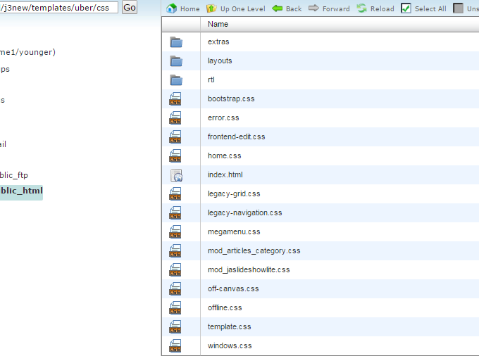
February 1, 2016 at 6:23 pm #873715Should I already have a templates/uber/css/custom.css file? I cannot find it. I have added an image of the files in this folder.
If I need to add the file, do I need to use dreamweaver to do it?
Ninja Lead
Moderator
Ninja Lead
- Join date:
- November 2014
- Posts:
- 16064
- Downloads:
- 310
- Uploads:
- 2864
- Thanks:
- 341
- Thanked:
- 3854 times in 3563 posts
February 2, 2016 at 8:02 am #874124Any template built with T3 framework will support ‘custom.css’ file to hold all custom css code on your site but by default, this file doesn’t exist and you need to create it.
Or just download my attached file and unzip > copy to your site in above directory.
kella@youngerusa.com
- Join date:
- January 2016
- Posts:
- 65
- Downloads:
- 46
- Uploads:
- 23
- Thanks:
- 9
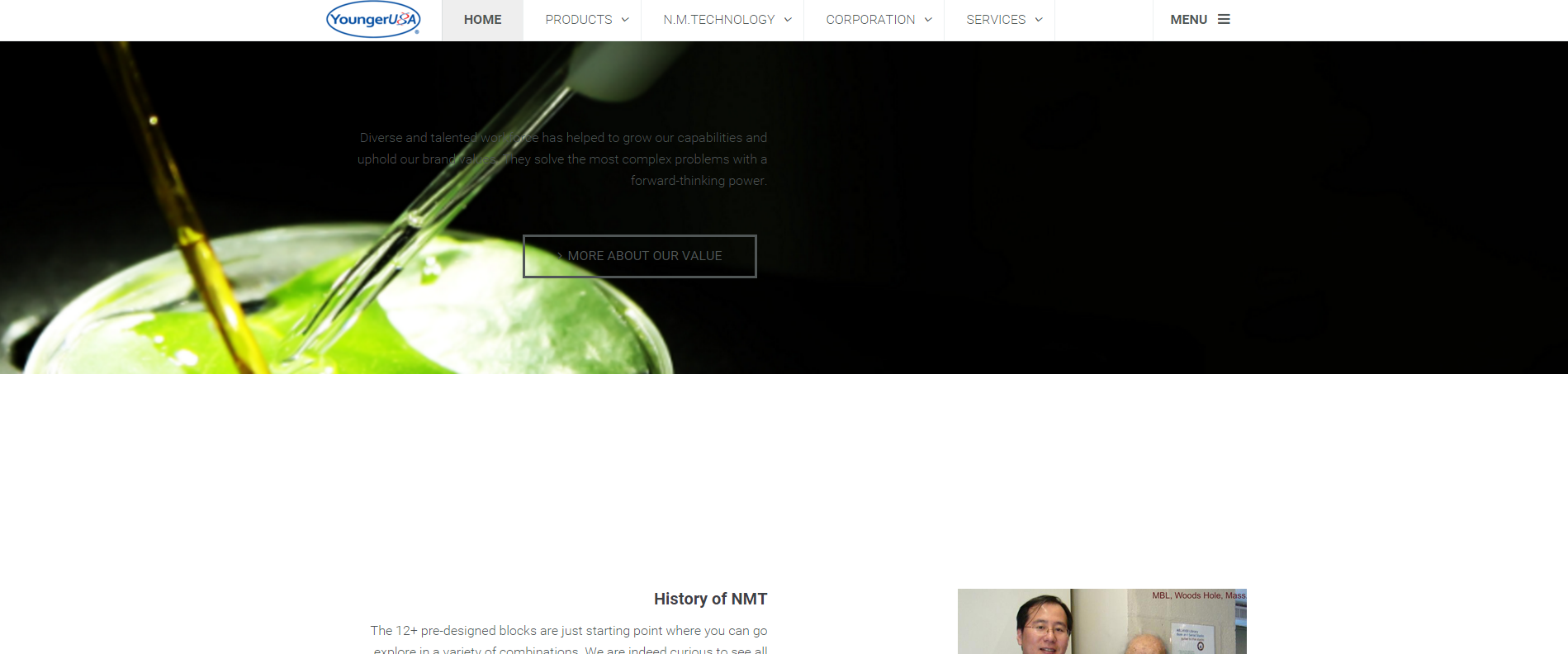
February 2, 2016 at 3:53 pm #874410Thank you, that seems to have helped a little. As you can see the new image I posted below is again hero 6 but now with the custom.css file in place.
However, I am hoping that I can have the text and buttons stay in the same place when the screen gets smaller. This way it looks the same on all computer screens (I don’t care if the mobile screens are different, but at least all computer screens should be the same). See the second image for how it presents on a smaller computer screen.
 Ninja Lead
Moderator
Ninja Lead
Moderator
Ninja Lead
- Join date:
- November 2014
- Posts:
- 16064
- Downloads:
- 310
- Uploads:
- 2864
- Thanks:
- 341
- Thanked:
- 3854 times in 3563 posts
February 3, 2016 at 7:14 am #875150Try to change this way
Open templates/uber/css/custom.css file
find and change
.acm-hero {
    background-size: cover !important;
}
to
@media screen and (max-width: 767px) {
    .acm-hero {
        background-size: 100% !important;
    }
}
@media  (min-width: 1200px) {
    .acm-hero {
        background-size: cover !important;
    }
}
@media screen and (min-width: 992px) {
    .acm-hero {
        background-size: cover !important;
    }
}
kella@youngerusa.com
- Join date:
- January 2016
- Posts:
- 65
- Downloads:
- 46
- Uploads:
- 23
- Thanks:
- 9
February 3, 2016 at 2:08 pm #875463I tried it but still no luck
Ninja Lead
Moderator
Ninja Lead
- Join date:
- November 2014
- Posts:
- 16064
- Downloads:
- 310
- Uploads:
- 2864
- Thanks:
- 341
- Thanked:
- 3854 times in 3563 posts
February 4, 2016 at 6:38 am #876051I will forward that problem to the development team for further checking. You can give me admin login and FTP account of your site via your reply and set as private reply
-
AuthorPosts
This topic contains 23 replies, has 2 voices, and was last updated by
Ninja Lead 8 years, 2 months ago.We moved to new unified forum. Please post all new support queries in our New Forum
Jump to forum