-
AuthorPosts
-
October 28, 2017 at 12:49 pm #1070620
Hi,
I would like to hide the Main Menu in iPad Mode ( Res1024 ) like i did it on 768 x 1024. I have already this CCS code.
@media (max-width:991px){.t3-mainnav .t3-navbar{display:none!important;}}I changed the value to 1024px instead of 991px but seems that does not hide the Main Menu for 1024 x 768 devices.
Can you please advise?
 Pankaj Sharma
Moderator
Pankaj Sharma
Moderator
Pankaj Sharma
- Join date:
- February 2015
- Posts:
- 24589
- Downloads:
- 144
- Uploads:
- 202
- Thanks:
- 127
- Thanked:
- 4196 times in 4019 posts
October 30, 2017 at 2:47 am #1070805Hi
its not the correct way to change the view.
Open template folder /less/variable.less file
find// Point at which the navbar stops collapsing @grid-float-breakpoint: @screen-sm-min;Now change @screen-sm-min; with a value where you want to stop the menu breakpoint for collapse navigation.
after this step compile less to css.
take backup of custom changes before compiling less to css.Regards
October 30, 2017 at 5:16 am #1070850Hi,
Can you be specific about where to add value in code? At resolution 1024px i want to show only Off Canvas and not Main Menu.
Regards
Pankaj Sharma
Moderator
Pankaj Sharma
- Join date:
- February 2015
- Posts:
- 24589
- Downloads:
- 144
- Uploads:
- 202
- Thanks:
- 127
- Thanked:
- 4196 times in 4019 posts
October 30, 2017 at 6:54 am #1070859Hi
@screen-sm-min;Replace it with a value, the value you will add is for the breakpoint of the menu.
Regards
October 30, 2017 at 9:16 am #1070914This is a correct code?
@grid-float-breakpoint: 1200px
Regards
Pankaj Sharma
Moderator
Pankaj Sharma
- Join date:
- February 2015
- Posts:
- 24589
- Downloads:
- 144
- Uploads:
- 202
- Thanks:
- 127
- Thanked:
- 4196 times in 4019 posts
October 30, 2017 at 9:33 am #1070927This is a correct code?
@grid-float-breakpoint: 1200px
Regards
Yes, its correct.
Regards
October 30, 2017 at 3:36 pm #1071028Hi,
I am sorry but i can not find such a string in folder /templates/ja_hotel/less/variables.less
// Point at which the navbar stops collapsing
@grid-float-breakpoint: @screen-sm-min;I check trhought but i can not find it.
Pankaj Sharma
Moderator
Pankaj Sharma
- Join date:
- February 2015
- Posts:
- 24589
- Downloads:
- 144
- Uploads:
- 202
- Thanks:
- 127
- Thanked:
- 4196 times in 4019 posts
October 31, 2017 at 2:00 am #1071135Hi
Kindly share the site super user details in Private reply.
I will share the path and code with a screenshot from your site.Regards
October 31, 2017 at 6:21 am #1071224This reply has been marked as private.Pankaj Sharma
Moderator
Pankaj Sharma
- Join date:
- February 2015
- Posts:
- 24589
- Downloads:
- 144
- Uploads:
- 202
- Thanks:
- 127
- Thanked:
- 4196 times in 4019 posts
October 31, 2017 at 6:57 am #1071231Hi
you can find it in the line 310
here is the code you are looking for// Point at which the navbar stops collapsing @grid-float-breakpoint: @screen-sm-min;Replace
@screen-sm-min with 1024pxRegards
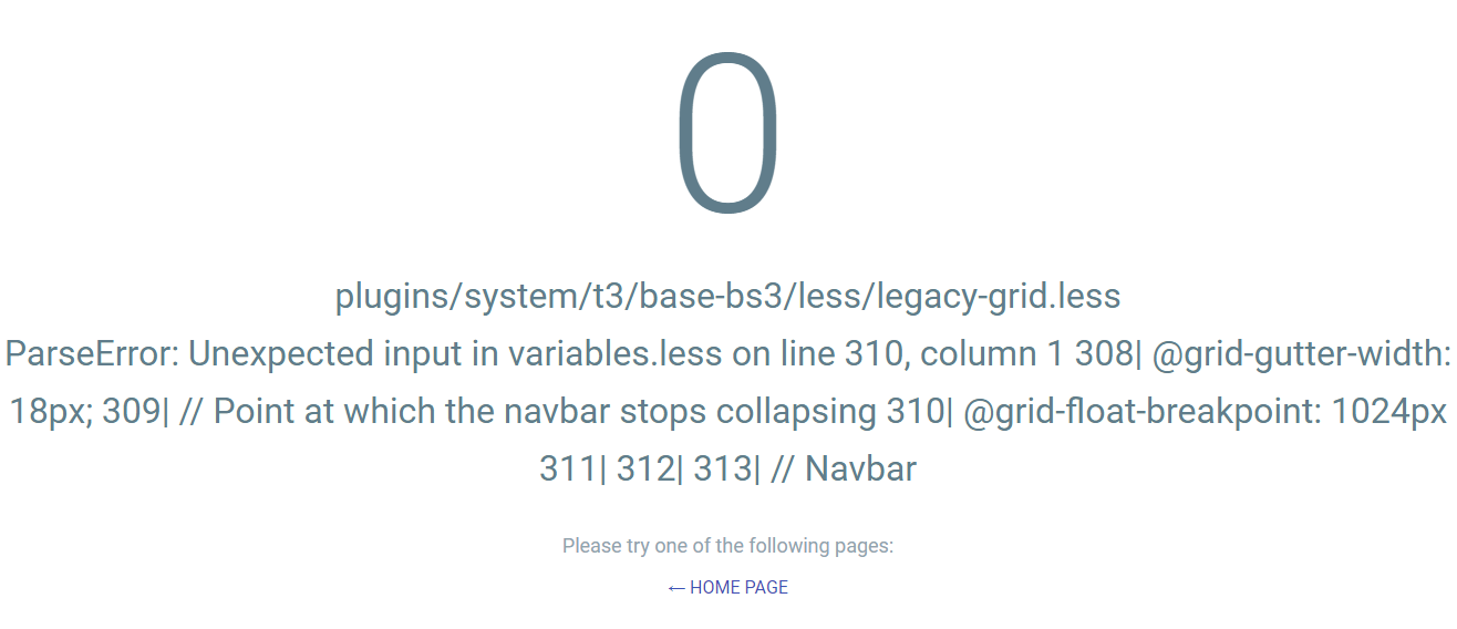
October 31, 2017 at 7:10 am #1071234Hi, I get this error. Is it something with code?
Pankaj Sharma
Moderator
Pankaj Sharma
- Join date:
- February 2015
- Posts:
- 24589
- Downloads:
- 144
- Uploads:
- 202
- Thanks:
- 127
- Thanked:
- 4196 times in 4019 posts
October 31, 2017 at 7:23 am #1071242Hi
there is syntax error that i fixed.
Please check it now.
RegardsOctober 31, 2017 at 7:42 am #1071252Hi, Error was fixed but I do not see any difference in Template. Menu Bar is still there in Device 1024px
Pankaj Sharma
Moderator
Pankaj Sharma
- Join date:
- February 2015
- Posts:
- 24589
- Downloads:
- 144
- Uploads:
- 202
- Thanks:
- 127
- Thanked:
- 4196 times in 4019 posts
October 31, 2017 at 7:56 am #1071254This reply has been marked as private.October 31, 2017 at 8:32 am #1071265Yes, I compile less to css.
AuthorPostsThis topic contains 18 replies, has 2 voices, and was last updated by
Pankaj Sharma 6 years, 5 months ago.We moved to new unified forum. Please post all new support queries in our New Forum
Jump to forum

