-
AuthorPosts
-
 Pankaj Sharma
Moderator
Pankaj Sharma
Moderator
Pankaj Sharma
- Join date:
- February 2015
- Posts:
- 24589
- Downloads:
- 144
- Uploads:
- 202
- Thanks:
- 127
- Thanked:
- 4196 times in 4019 posts
June 28, 2016 at 9:56 am #944811Hi
because the items are more then the space , they does not fit in single line . You can reduce the max width value for menu item that u applied to 170px then they can fit .
You can use Media queries to apply the style for different screen sizes .
Here : getbootstrap.com/css/#grid-media-queries1 user says Thank You to Pankaj Sharma for this useful post
June 29, 2016 at 7:00 am #945301As far as I know there are already media queries included in the purity 3 css-files. And for example on my WQHD-screen the menu buttons are not split evenly. I changed the width to 170px and the result is seen in the screenshot below.
I presume that my knowledge about joomla / html and css is not enough to make the needed changes.
Pankaj Sharma
Moderator
Pankaj Sharma
- Join date:
- February 2015
- Posts:
- 24589
- Downloads:
- 144
- Uploads:
- 202
- Thanks:
- 127
- Thanked:
- 4196 times in 4019 posts
June 29, 2016 at 7:14 am #945303Hi
You need to apply different screen size media queries to apply the styles via custom.css file .
The query works on the screen size u add in the code , for example@media (max-width:468px) { .class{width:170px; }}
will work when screen size is maximum 468px . This way you can achieve this .1 user says Thank You to Pankaj Sharma for this useful post
June 29, 2016 at 7:34 am #945335Can I add these in the template.css or do I have to create a custom.css ?
//Edit:
I tried editing the media-queries in the css with firebug. And I think there is another problem: the div.container and all the following objects (nav.t3-navbar-collapse.collapse, div.t3-megamenu, ul.nav.navbar-nav.level0 …) are to small. On my WQHD Screen the menu button wont show correctlyPankaj Sharma
Moderator
Pankaj Sharma
- Join date:
- February 2015
- Posts:
- 24589
- Downloads:
- 144
- Uploads:
- 202
- Thanks:
- 127
- Thanked:
- 4196 times in 4019 posts
June 29, 2016 at 11:12 am #945430Hi
In case you want to increase the size of the menu item , you need to define the new style code in custom.css file to specific screen size to increase its size .
Use inspect element or firebug from browser to check the style and apply code like i posted example .
Here is code.navbar-default .navbar-nav > li > a { font-size: 12px; }1 user says Thank You to Pankaj Sharma for this useful post
June 29, 2016 at 1:05 pm #945449Now i’ve got this code in the css:
@media screen and (min-width: 991px) {
.navbar-default .navbar-nav > li {
max-width: 180px;
display: block;
margin-right: 61px;It looks good on a 19201080 or a 25601440 screen. But on smaller ones the margin is too much. How can i change this without affecting the collapsed mobile megamenu?
And if i resize my screen I dont want to jump the menu buttons to a second line. The margin between the button should become smaller and smaller till the point where there is no space left. On this point the megamenu should collapse to the mobile version.Sorry for my bad englisch :<
Pankaj Sharma
Moderator
Pankaj Sharma
- Join date:
- February 2015
- Posts:
- 24589
- Downloads:
- 144
- Uploads:
- 202
- Thanks:
- 127
- Thanked:
- 4196 times in 4019 posts
June 30, 2016 at 1:18 am #945585Hi
this is custom work in the style codes , kindly apply the same suggestion as i suggested above to change the margin/padding via custom.css file and using media queries .I also suggest you to upgrade membership to JATC/Dev memberships to get more flexible support on custom works .
1 user says Thank You to Pankaj Sharma for this useful post
June 30, 2016 at 6:11 am #945689Thanks so far. I will try media queries in custom.ccs
Where to put the custom.css? ..purity_iii/local/css/themes/[myname]/ or in purity_iii/css ?
Thanks again for the help!Pankaj Sharma
Moderator
Pankaj Sharma
- Join date:
- February 2015
- Posts:
- 24589
- Downloads:
- 144
- Uploads:
- 202
- Thanks:
- 127
- Thanked:
- 4196 times in 4019 posts
June 30, 2016 at 7:51 am #945726Big thanks!
And where can I change the point on wich the megamenu will collapse to the mobile menu version? Thx
Pankaj Sharma
Moderator
Pankaj Sharma
- Join date:
- February 2015
- Posts:
- 24589
- Downloads:
- 144
- Uploads:
- 202
- Thanks:
- 127
- Thanked:
- 4196 times in 4019 posts
July 4, 2016 at 2:27 am #946443Hi
Go to /less/variable.less
Find`
// Point at which the navbar stops collapsing
@grid-float-breakpoint: @screen-sm-max;repalce it with// Point at which the navbar stops collapsing
@grid-float-breakpoint: 992px;change 992px with your values . After save, compile Less to css from template options . Take backup of site before apply these changes .1 user says Thank You to Pankaj Sharma for this useful post
October 14, 2016 at 6:32 am #976225Thanks Pankaj!
I have another problem and i cant seem to find a solution.
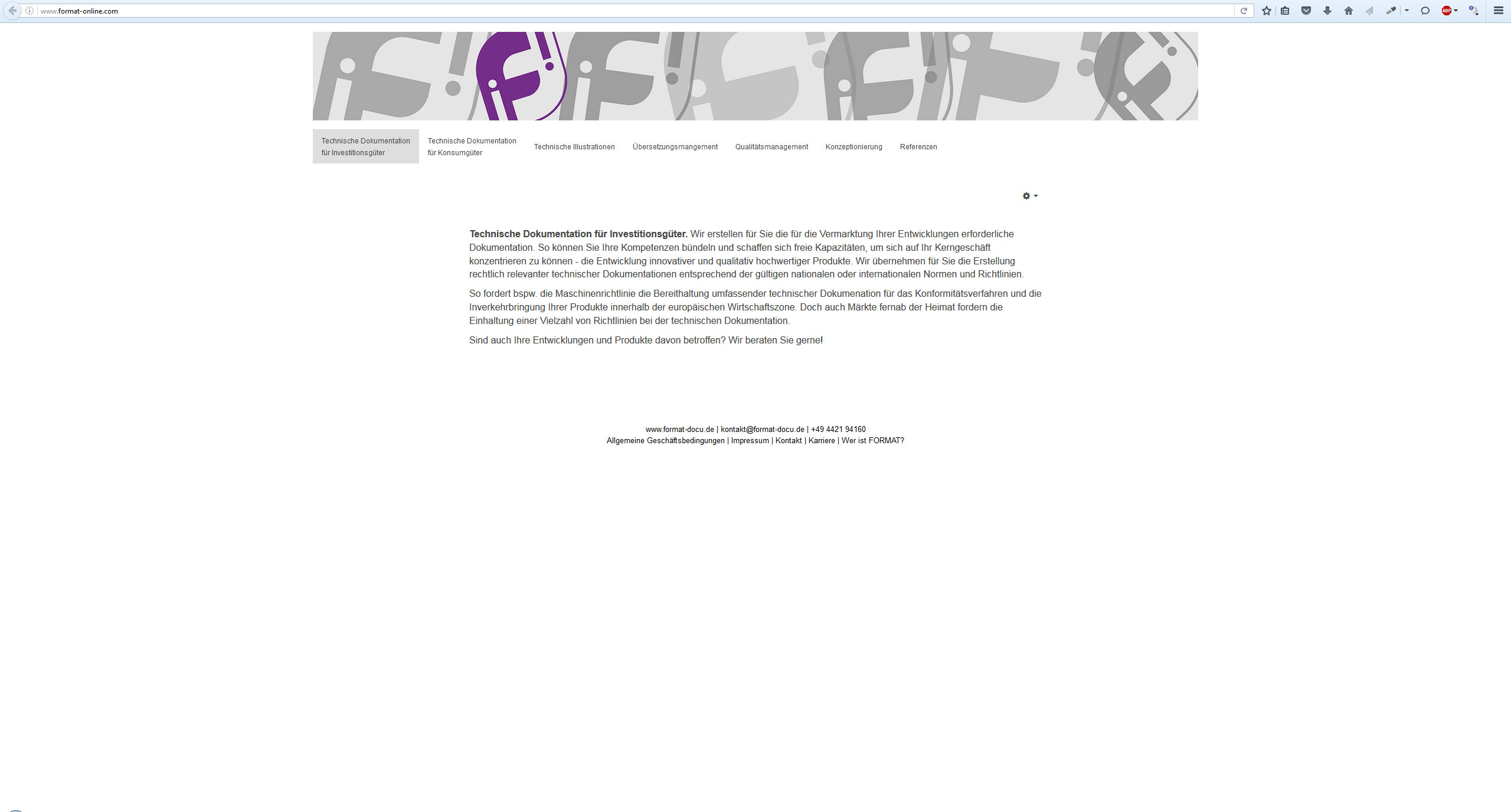
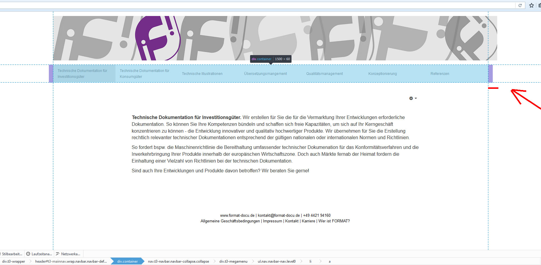
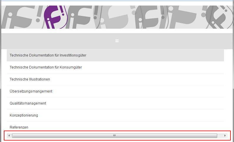
Please be so kind and take a look on my site http://www.format-online.com/index.php/de/Decrease your brwoser window until the navbar starts to collapse. If you click on the collapsed menu the different menu items will show up. But the collapsed menu has a scolling bar on the bottom.
I used an inspection tool to find the point in the template.css where i should be able to add a "max-width". I tried editing the css but the changes wont show on the live page. I dont know how to get rid of the scrolling bar.Any ideas? Thanks in advance.
Pankaj Sharma
Moderator
Pankaj Sharma
- Join date:
- February 2015
- Posts:
- 24589
- Downloads:
- 144
- Uploads:
- 202
- Thanks:
- 127
- Thanked:
- 4196 times in 4019 posts
October 14, 2016 at 7:41 am #976243Hi
You can set a max-width value by adding below code in custom.css file
Change the width value depends on you needs ..t3-mainnav .t3-navbar-collapse .navbar-nav { max-width: 700px; }October 14, 2016 at 8:04 am #976257WOW! That worked instantly! Thanks so much mate.
Another basic thing:
After your last post i created the custom.css and inserted the code there.
Prior to that i just edited the original css files (template.css / bootstrap.css…). Now i begin to understand that this was not the best way of doing it.Is there any way to find the edited parts in the original css files and copy them over to the custom.css? What problems could occure if i keep them the way they are?
Pankaj Sharma
Moderator
Pankaj Sharma
- Join date:
- February 2015
- Posts:
- 24589
- Downloads:
- 144
- Uploads:
- 202
- Thanks:
- 127
- Thanked:
- 4196 times in 4019 posts
October 14, 2016 at 8:17 am #976261Hi
Custom.css file will not be affected when template is updated , regarding copy the custom work , yes you can override the style code in custom.css file ,
But I am afraid I do not give u the path of your changes since it personal custom work did by you .AuthorPostsThis topic contains 16 replies, has 2 voices, and was last updated by
Bummi 7 years, 6 months ago.
The topic ‘Help with megamenu plz’ is closed to new replies.
Jump to forum

