-
AuthorPosts
-
May 20, 2017 at 5:16 am #1035566
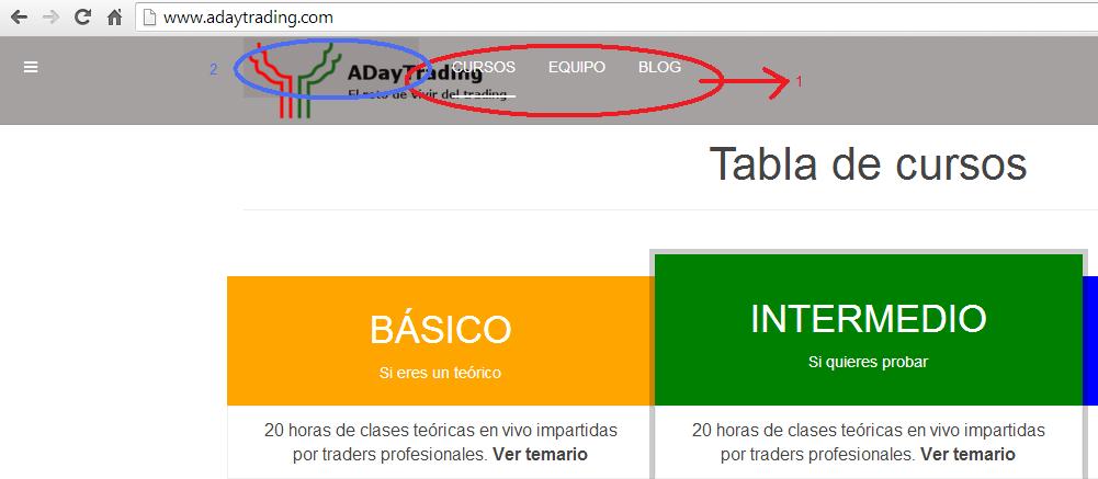
i’ve add this code to my custom.css and logo looks good. However, as you can see in the picture in red, menu overlaps with the logo. how can i fix it?
 Pankaj Sharma
Moderator
Pankaj Sharma
Moderator
Pankaj Sharma
- Join date:
- February 2015
- Posts:
- 24589
- Downloads:
- 144
- Uploads:
- 202
- Thanks:
- 127
- Thanked:
- 4196 times in 4019 posts
May 22, 2017 at 12:53 am #1035790Hi
Kindly share your working site URL here.
I will check the logo issue.Regards
May 22, 2017 at 10:47 am #1036007Hi,
http://www.adaytrading.comthanks!
Pankaj Sharma
Moderator
Pankaj Sharma
- Join date:
- February 2015
- Posts:
- 24589
- Downloads:
- 144
- Uploads:
- 202
- Thanks:
- 127
- Thanked:
- 4196 times in 4019 posts
May 23, 2017 at 1:37 am #1036128Hi
Add below code in custom.css file to fix this issue.logo-image > a { max-width: 300px; max-height: 80px; }Regards
May 23, 2017 at 4:41 am #1036207Thanks, now it looks rigth!
another question, if i want to change menu text color. By default is in white, i would like to be in black. I’ve tried to change it by themeMagic but i cannot find the way to do it. Can you help me?
Pankaj Sharma
Moderator
Pankaj Sharma
- Join date:
- February 2015
- Posts:
- 24589
- Downloads:
- 144
- Uploads:
- 202
- Thanks:
- 127
- Thanked:
- 4196 times in 4019 posts
May 23, 2017 at 5:10 am #1036219You are welcome!
For a new topic please open a new thread. It also helps our community.Regards
May 23, 2017 at 5:25 am #1036231I’ve check it works in computer view, but it doesn’t in mobile. what can i do?
For the new question, i´ll open a new topic, thanks!
Pankaj Sharma
Moderator
Pankaj Sharma
- Join date:
- February 2015
- Posts:
- 24589
- Downloads:
- 144
- Uploads:
- 202
- Thanks:
- 127
- Thanked:
- 4196 times in 4019 posts
May 23, 2017 at 5:34 am #1036238Hi
Replace my older code with this code.logo-image > a {max-width: 300px;max-height: 90px;} .navbar { min-height: 90px; }Regards
May 23, 2017 at 6:23 am #1036243much better! however still on the mobil, the submenu opens before the logo ends. How do I get it to open just after?
Pankaj Sharma
Moderator
Pankaj Sharma
- Join date:
- February 2015
- Posts:
- 24589
- Downloads:
- 144
- Uploads:
- 202
- Thanks:
- 127
- Thanked:
- 4196 times in 4019 posts
May 24, 2017 at 1:13 am #1036504Hi
Because the logo is bigger in mobile you are getting this issue.
Add below code in custom.css file.t3-mainnav .t3-navbar-collapse { margin-top: 88px; }Regards
May 24, 2017 at 4:36 am #1036565thanks, now logo fits perfect in mobile devices!
Just a last question about this issue. Is it possible to use to different logos? one for mobile devices and another one for bigger ones? if the answer is yes, i’ll open a new post.Pankaj Sharma
Moderator
Pankaj Sharma
- Join date:
- February 2015
- Posts:
- 24589
- Downloads:
- 144
- Uploads:
- 202
- Thanks:
- 127
- Thanked:
- 4196 times in 4019 posts
May 24, 2017 at 5:03 am #1036575Yes!
You can upload it from template options.
Enable small logo and upload it.AuthorPostsViewing 12 posts - 1 through 12 (of 12 total)This topic contains 11 replies, has 2 voices, and was last updated by
Pankaj Sharma 6 years, 11 months ago.We moved to new unified forum. Please post all new support queries in our New Forum
adjust logo width
Viewing 12 posts - 1 through 12 (of 12 total)