I have a header with a logo at the top of the site and a slider below. Looks good on PC. But on mobile I'd like to see them both fill the entire width of the screen. Can you help me achieve this with CSS?
Regards, Wouter
woodyf4u
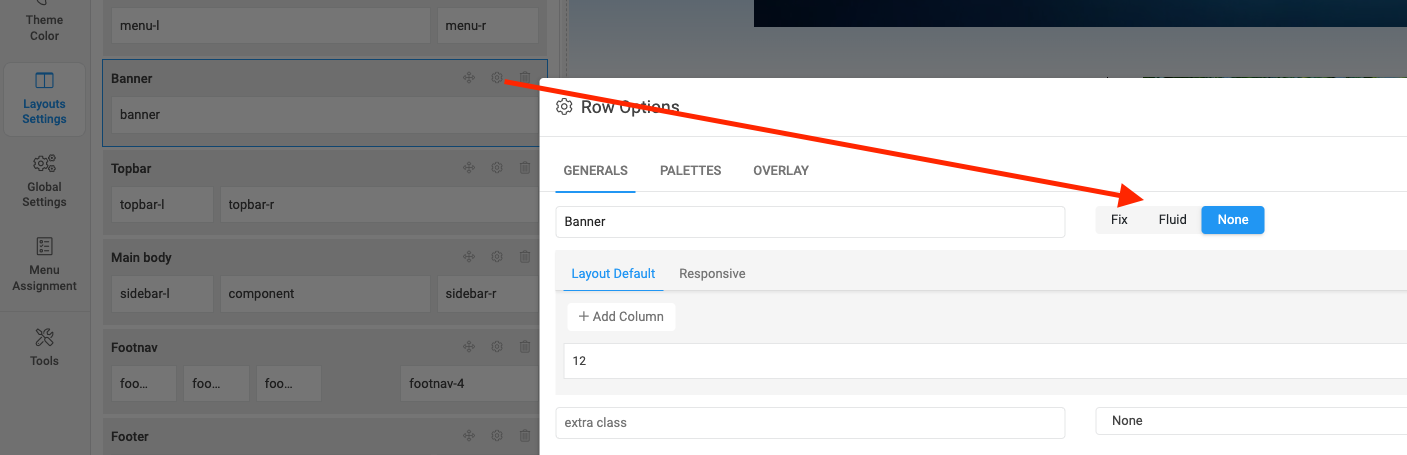
You set this banner section within a container which is set with a fixed width in template so I updated the layout container in Layout settings:
Kindly check.
Thank you. Learned something again. But now that banner is 1200px wide. And the content of the template is a maximum of 985px everywhere. How can I set the banner to be a maximum of 985px wide?
I updated this code for you:
@media (min-width: 1200px){
    .t4-banner .t4-section-inner.container-fluid {
        max-width: 985px;
    }
}
Thank you for your quick nsupport. This topic is solved.