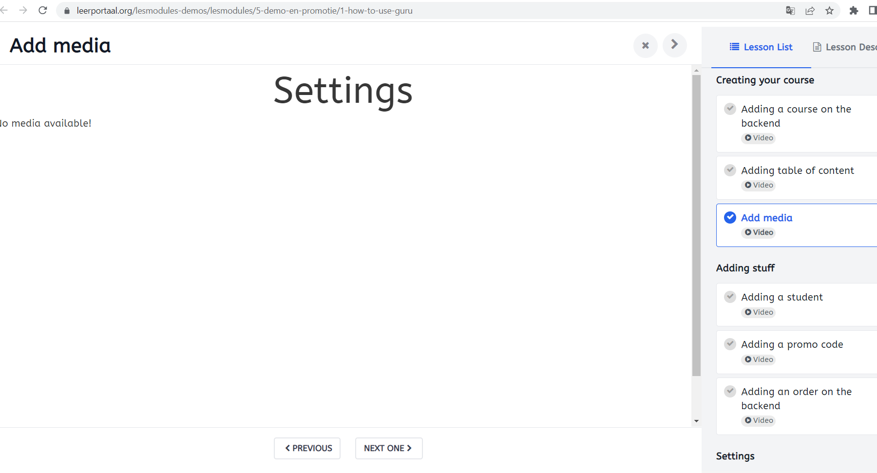
We've got problems with the background of our lessons. When you open a lesson you can see (top and bottom) the website coming through. It's very distracting. When I look at your demo's the background is dark. How can I solve this? Please check the link to our demo-site where we put the Guru demo lesson to compare.
Thank you in advance!
machroel Hi Can u share the link of demo as we have multiple demo and based on the template it may have different style. I checked your site and it looks normal the course has black area behind.
Thanks for your quick response!
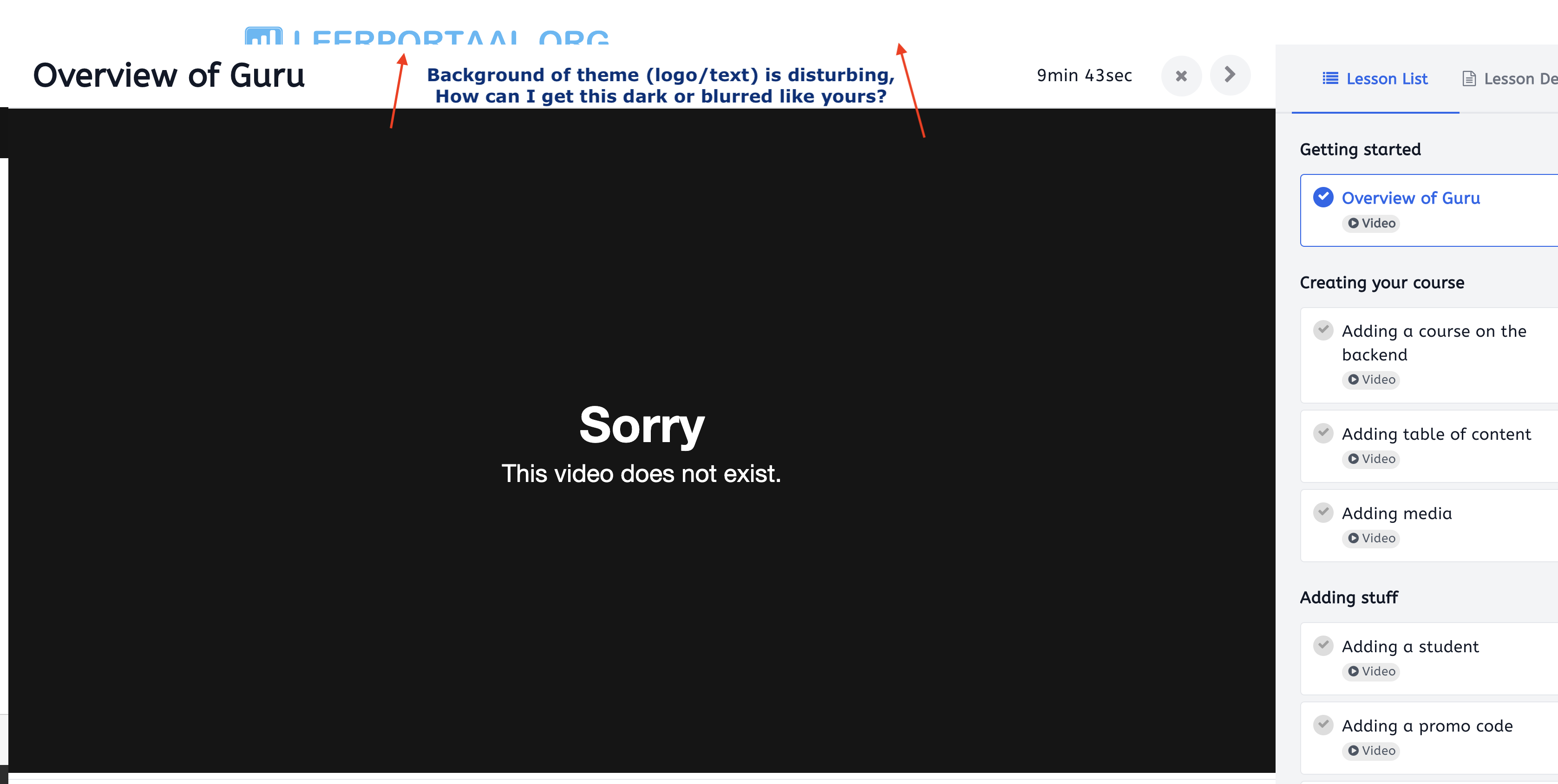
Maybe I wasn't specific enough. Hopefully these attached images make it more clearer. I don't mean the slide of the lesson itself, but behind it you can see the website. And because it's also white and the slide has no border, it looks like it's blended together.
Maybe this is not a Guru 'problem' actually. Please let me know what you think.
Our website:
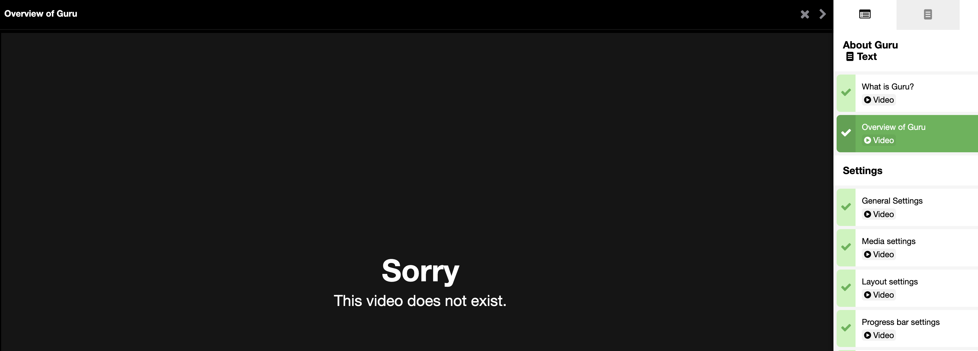
Your DEMOSITE:
https://ijoomlademo.com/index.php/ijoomla-extensions/guruPrograms/5-ijoomla-extensions/18-guru
machroel Hi The older demo is for Joomla 3 only use Guru 5.2.5 version in 6.0 version there is UI changes with new style. I checked the course u added in edit fields and it is normal I also checked some other course on your site and they also normal
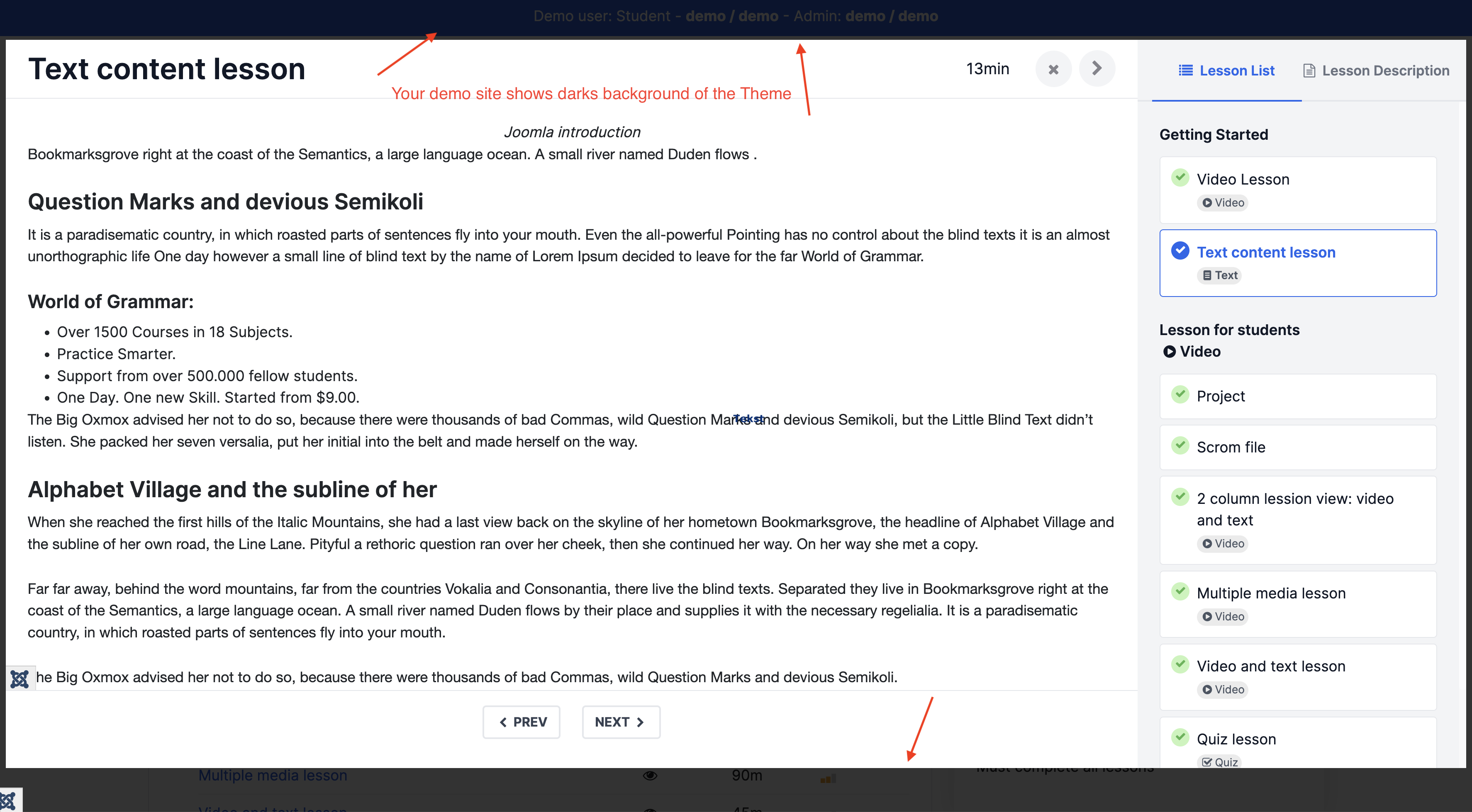
I find it hard to believe actually. Maybe I am wrong but this Demo is Joomla4 isn't it? URL: https://guru.ijoomlademo.com/index.php/courses/courses
And this is an example of a course of your DEMO: URL: https://guru.ijoomlademo.com/index.php/joomla/course/1-joomla/103-joomla-4-basic
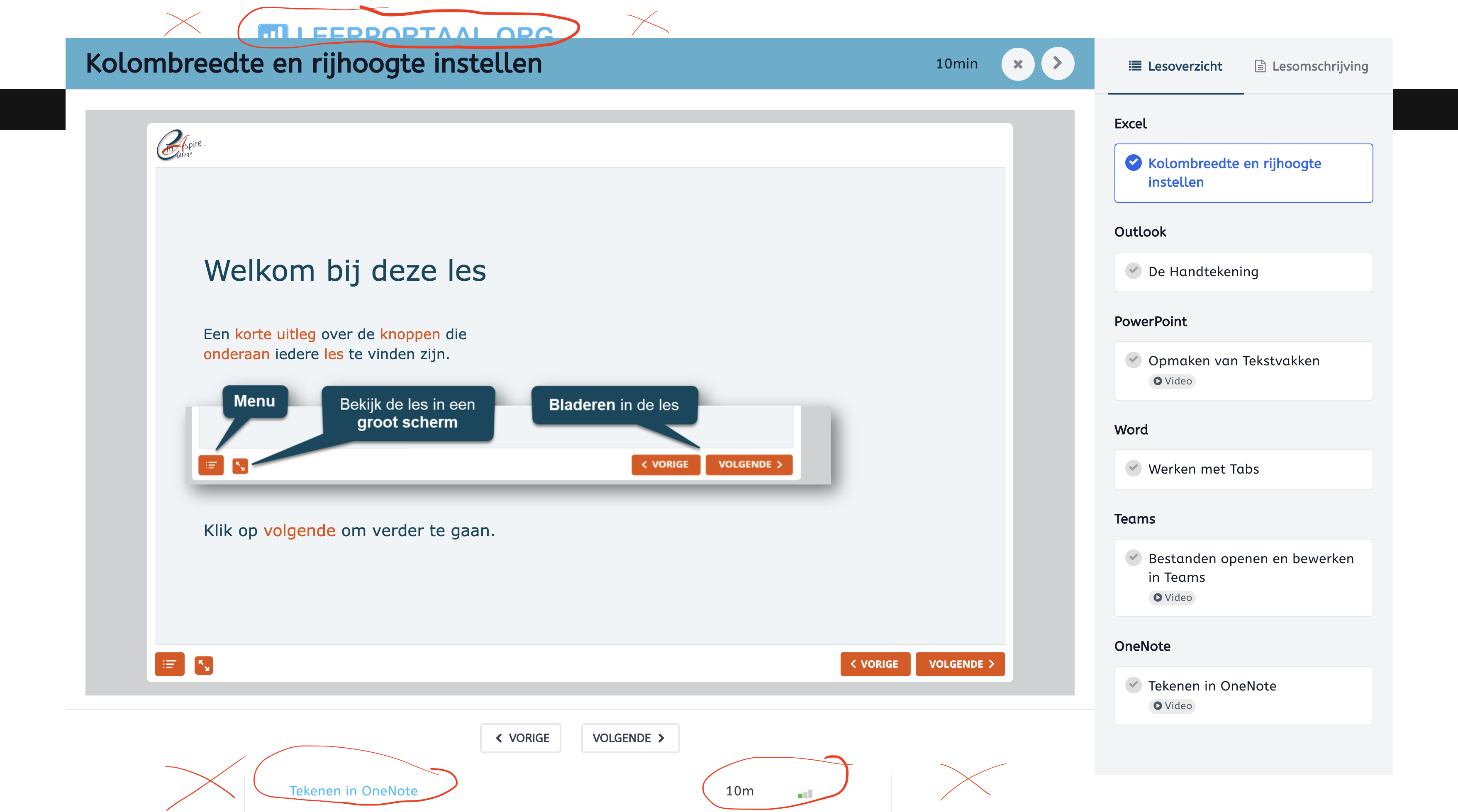
It's a big difference between those two if you look at the top. The normal site is blue and in the course it's dark and almost not readable. How is this possible?
PS on a tablet/iPad I don't have this problem
machroel Hi Based on Joomla template you are using style may change. I tried to check same URL but it no longer active on your site and redirected to homepage. Also share the screensize on which u have this issue as i shared last screenshot it looks normal
Hi Ninja,
this URL should work... https://www.leerportaal.org/lesmodules-demos/lesmodules/5-demo-en-promotie/13-voorbeeldlessen-microsoft-365
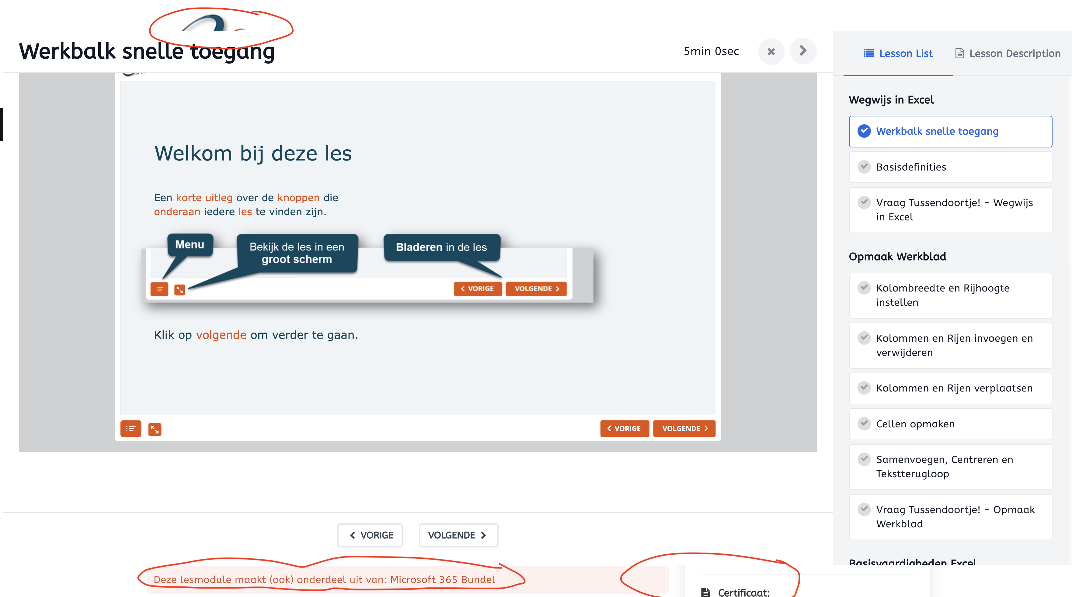
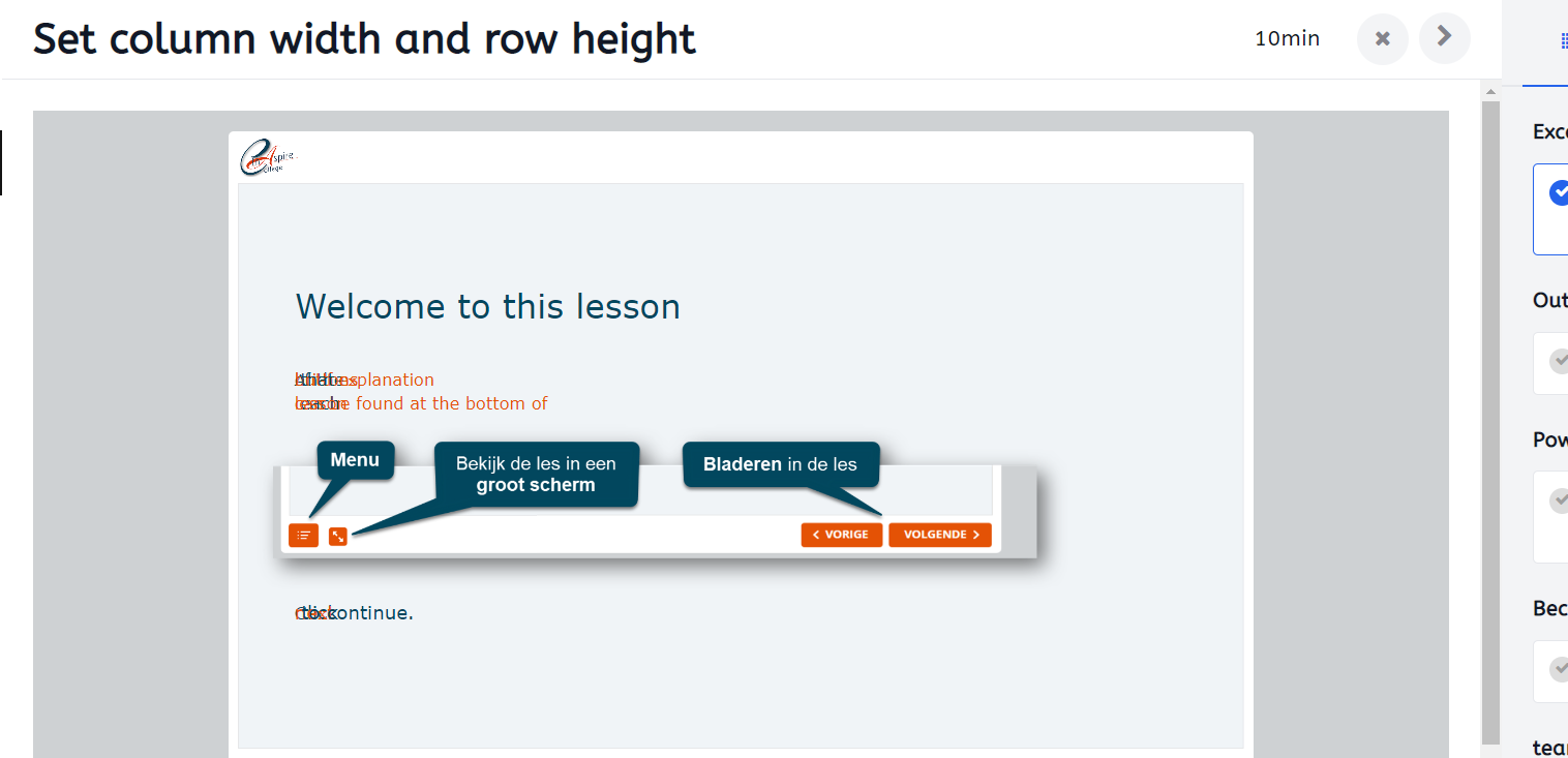
In the meantime I changed the color of the .guru lesson header. It's a little bit better but still not what we would like to have.
Check this image... you can see the logo (partly) on top and below you can see some text of the lesson page.
tia!
Hi Add this code in custom css
.guru-lesson {
    background: #fff;
    position: fixed;
    left: 0px;
    right: 0px;
    top: 0px;
    bottom: 0px;}
This will make the view edge to edge of screen.