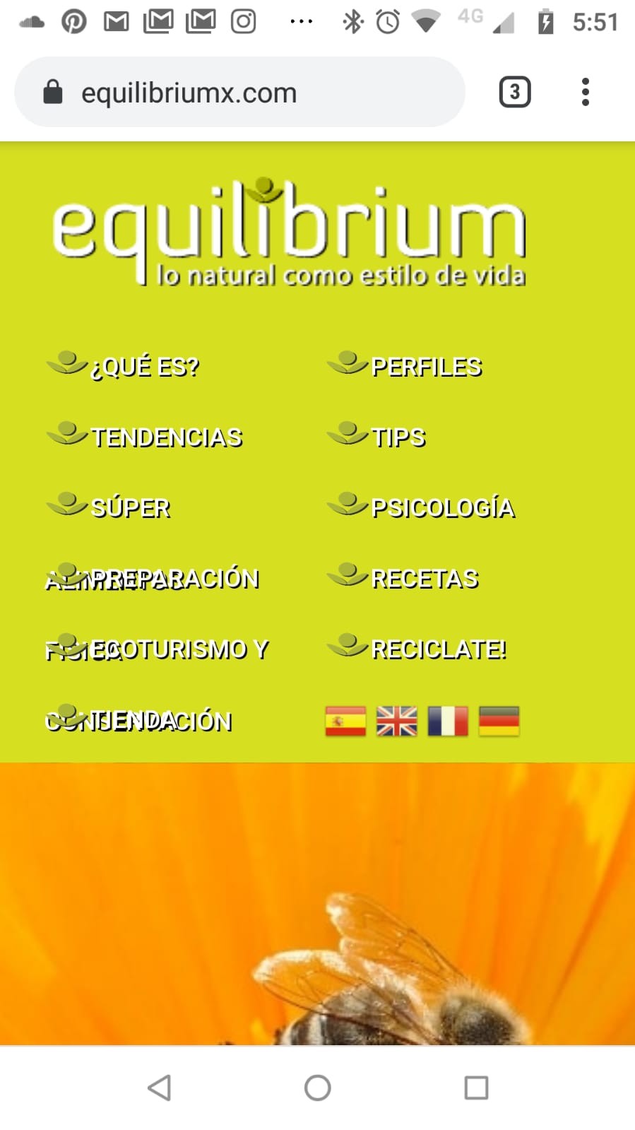
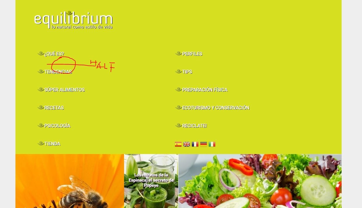
OK, we are ALMOST there...
the override for @Media size (7px) is not taking effect.. I dont know why...
I tried that size above in the css and looks nice in Mobile, but of course horrible in desktop
I tried playing a little bit with sizes, 10px is pretty good for mobile; but not for desktop.
If the @Media size override worked, 10px is fine, if I change the larger Menu Item title from ECOTURISMO Y CONSERVACION, for just CONSERVACION... (I guess if I change the menu Item Title, but not the ALIAS, I will not affect the url... right???)
#gkTop {
background: #d6df20;
}
#gkMainMenu .gkMenu>ul>li>a {
color: #ffffff;
font-size: 12px;
text-align: center;
text-shadow: 1px 1px
#000000;
}
#gkMainMenu {
padding: 5px;
}
#gkMainMenu .gkMenu>ul>li {
width: 25%;
padding-left: 1px;
}
#gkMainMenu .gkMenu>ul>li>a {
text-align: left;
}
@media (max-width: 820px){
#gkMainMenu .gkMenu>ul>li {
width: 46%;
padding-left: 1px;
font-size: 7px;
}
}
We are almost there.. One final push please! I really appreciate your patience...
Cheers, mate
Eduardo
