Hey guys!
Can you please look at making a few adjustments on the report page?
1. Add all data to report graph
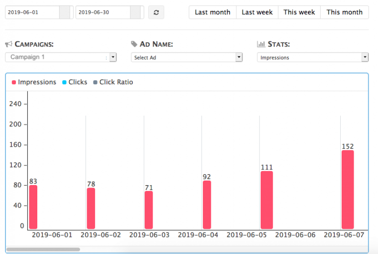
Right now if a client has more than one ad / campaign, the default display of the graph is to show the top campaign when the page loads
Is it possible to add an option to show the graph for ALL campaigns and have it default to that instead?
The way it currently is the user would have to calculate all of them to know.
2. Written Totals of Selected Campaign / Ad
If a client selects a report for a campaign and ad for a, lets say this month, the graph shows the totals but that's it. Theres no way to see the get the total unless you scroll through the graph and write down all the numbers for each day and then calculate them....
Can you add a visual of the total numbers somewhere, maybe just above the graph?
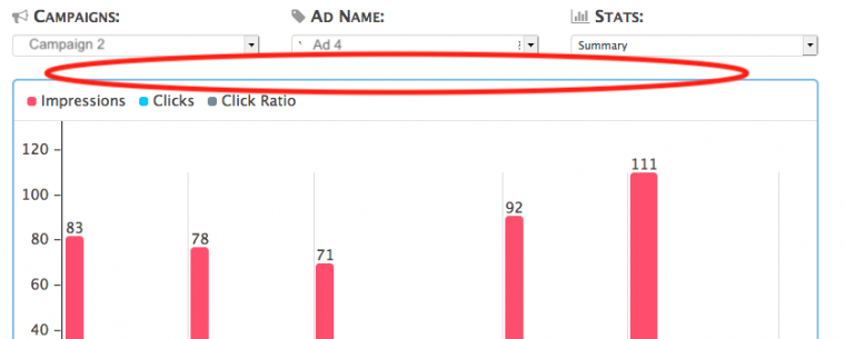
3. Bottom section below graph
There is text just below the graph that says "Date Range per Selected Period", is this in reference to the list below this text or the graph above?
If it's above, can you add a divider after it so it doesn't look like the header to the list below?
If it's to below, then I would assume that if I select a date range above that this lists numbers would change based on the date range, which it doesn't.
I'm assuming with current functionality that these numbers are just a total all together per campaign?
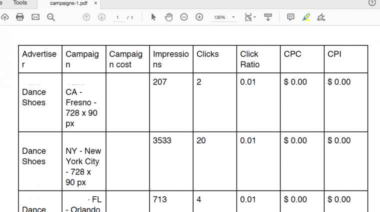
4. Export to PDF Report
Any way you could spruce this up a bit?
Maybe allow us to add our company logo and details?
Fix the font size so that the header text doesn't wrap?
Start / End dates of campaigns?
If cost of campaign is free, put free?
Thanks guys! It's comign right along 🙂
Adina