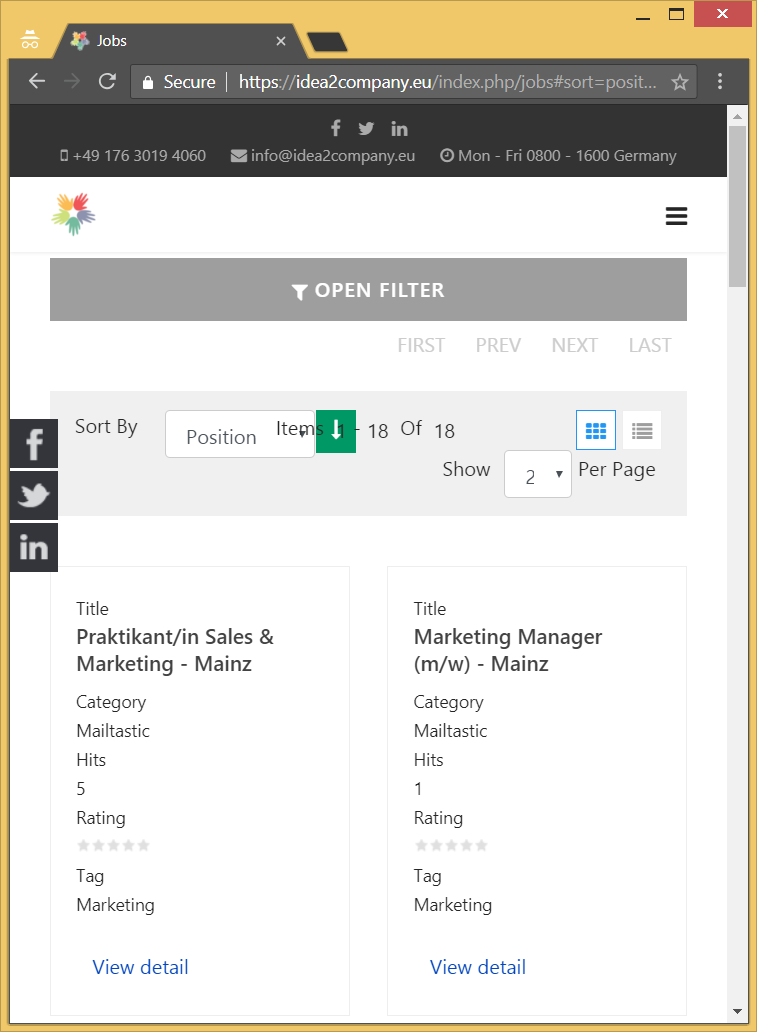
vp-007 As informed earlier that Responsive screen size has it own limitations regardless of template or platform being used which is majorly due to limited screen size so all the elements might not appear comfortably alongside each other in smaller screen sizes
I have another module. It responds in better way to changes in screen size.
Kindly see that the other module have different elements from the one seen for Megafilter toolbar. In the instance of Megafilter component also, The elements stack when the screen size goes smaller due to space limitations
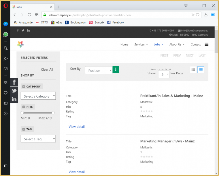
This is image from the extension demo. Look at the difference.
Please understand that the screenshot is from demo being shown in desktop mode and not responsive mode
To be more precise in assisting further with this relative query, Kindly provide screenshot marked with annotations showing as to how you wish to have the specific elements be seen in responsive screen size