
During the redesign process of JA Teline V, our team struggled to find out the best way to display this Joomla news template across mobile devices. Both options below will be available in JA Teline V for your choice:
- Fully responsive support (as in all our existing templates)
- Dedicated mobile solution (our code name JOBI - JoomlArt Mobile Sites)
You might wonder if JOBI makes any difference while responsive solution seems to cover all mobile stuffs as a standard way. The following comparison matrix will provide you clues behind our JOBI approach:
Note: As the development is still in progress, you might see adjustments and changes in the final deliverable.
Responsive vs. Dedicated mobile solution JOBI
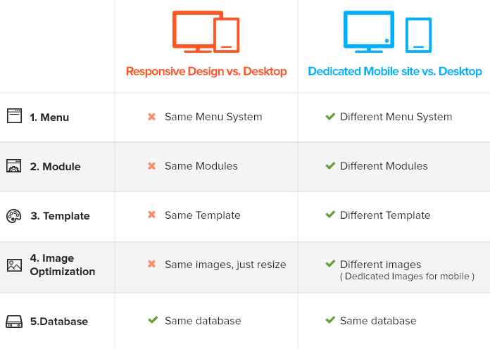
Responsive Design vs. Dedicated Mobile Site vs. Desktop
We will walk you through more details as follows:
1. Menu System
| Responsive Design | Dedicated Mobile Site |
|---|---|
| In all layouts (desktop, tablet, mobile), your site uses the same menu system. You can create a mobile menu system however when a user browses your site in mobile, it still loads all menu systems in which some menu items are hidden to fit the mobile UI purpose. | The menu systems on desktop and mobile are separated, one for desktop and one for mobile. When user browses your mobile site, only mobile menu system is loaded and displayed. This avoids the performance drawback of responsive approach due to unused items that are still being loaded. |
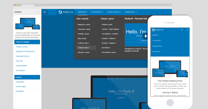
All menu items (including hidden menu items) are loaded in mobile.
2. Module system
| Responsive Design | Dedicated Mobile Site |
|---|---|
| The same circumstance occurs as in menu system. It makes use of the same modules in all layouts. However, to fit the responsive layouts, the modules are styled or hidden in specific layouts meanwhile the mobile view still loads all those modules (including hidden ones). This solves the UI aspects only. | There will be 2 separate module systems, one for mobile and one for desktop. Only modules created for Mobile are loaded and displayed in mobile layout. |
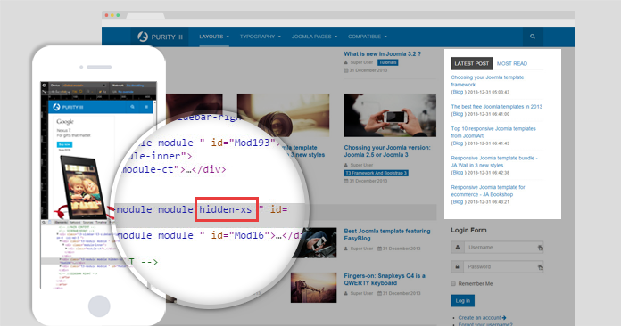
All modules including hidden ones are loaded in mobile view
3. Template
| Responsive Design | Dedicated Mobile Site |
|---|---|
| All responsive layouts use the same templates with same configurations. Even though there might be specific settings for a layout, general settings are the same which somewhat leads to the legacy mode. | Provides a solution to define and manage a separated template with its own settings for mobile view. This allows the template to have its own libraries and as a result the mobile site will be cleaner and more lightweight. |
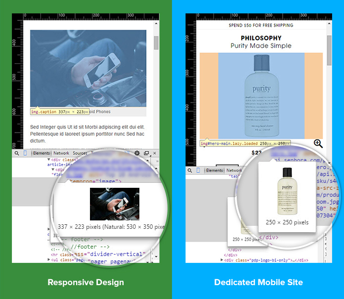
4. Image optimization
| Responsive Design | Dedicated Mobile Site |
|---|---|
| Use the same images in all layouts and the images are resized to fit each layout but the actual image size does not change, this can affect the loading time in mobile especially for the site with high content density. | Images are resized or cropped and stored in a specific folder. The respective images which are optimized for mobile will be loaded in mobile view. This helps to improve the loading time. |
How JOBI will be packaged?
JOBI package will comprise the followings:
- A component to set up and manage sites
- A system plugin: to manage data across sites
- Template
While waiting for our JOBI to take shape, hope you have first overview on direction we apply to make JA Teline V ready for mobile. Once available, you just need go through a few simple configurations to have dedicated mobile solution active. Our top priority is to give you an easy optimized and responsive ready template for news and magazine.
Would love to hear your suggestions regarding JA Teline V and JOBI!